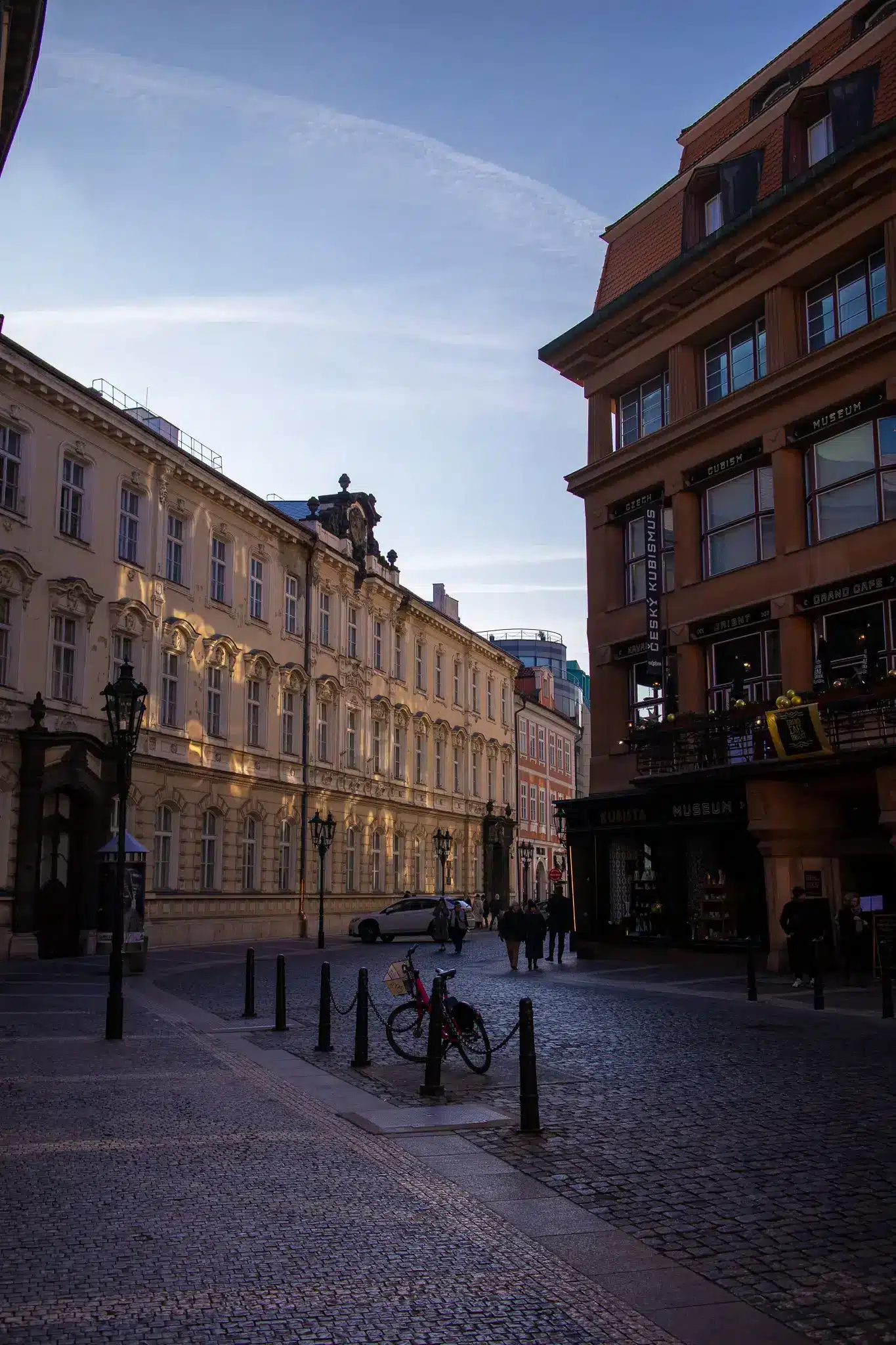
Prague is often flattened into a heritage postcard: towers, church spires, red roofs, December crowds. The photographs here point somewhere more interesting. They keep returning to the city’s moving parts — the tram sliding through a cobbled junction, the metro station with its unmistakable wall pattern, the bridge holding together both banks of the Vltava, the arcade that works less like a monument than a piece of indoor urban circuitry.
That matters because Prague is not simply a preserved old capital. It is a city where infrastructure is unusually visible and unusually composed. Public transport is not hidden behind neutral design language; it announces itself through color, typography, materials, and repetition. Even in winter, when market stalls and seasonal lighting temporarily reprogram the historic center, the deeper structure of the city is still about connection: tracks, platforms, passages, embankments, crossings.
The result is a version of Prague best understood not as a static collection of landmarks but as a designed system. The romance is there, sure, but it rides on logistics. People move through this city by tram, by metro, on foot across bridges, along river edges, and through arcades that blur commerce with culture. In these images, Prague looks less like a frozen museum than a place whose identity is carried, quite literally, by circulation.
The tram is not background scenery in Prague
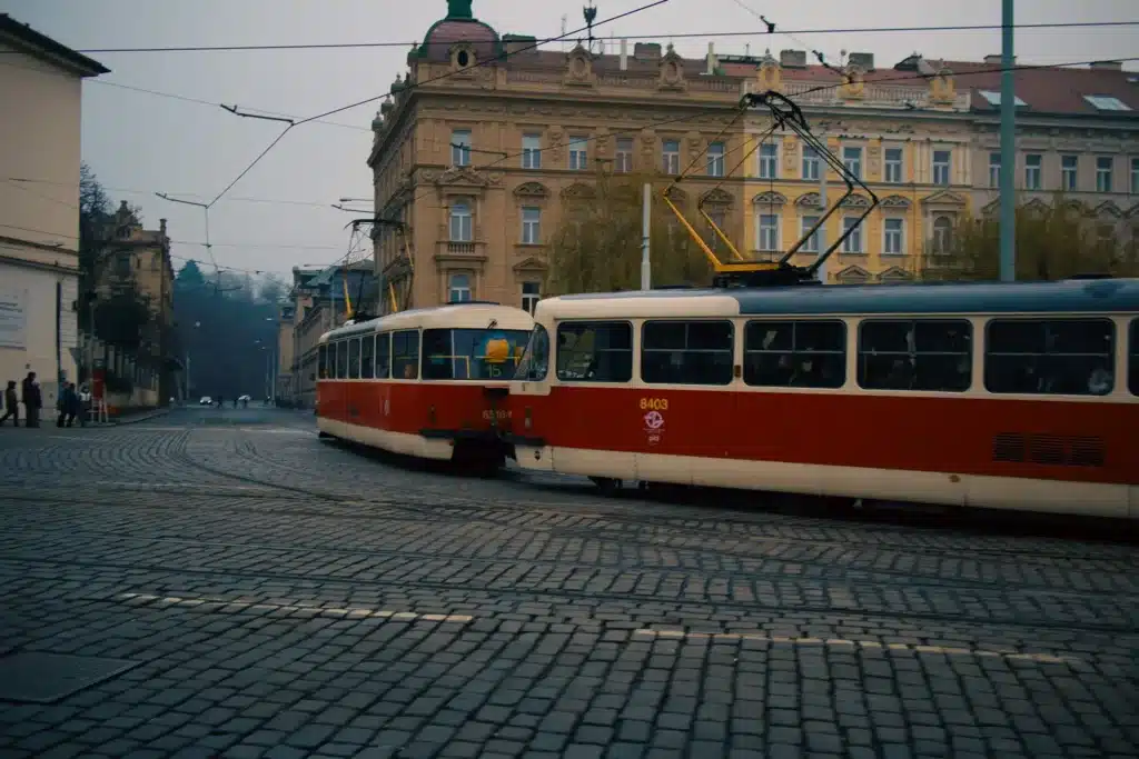
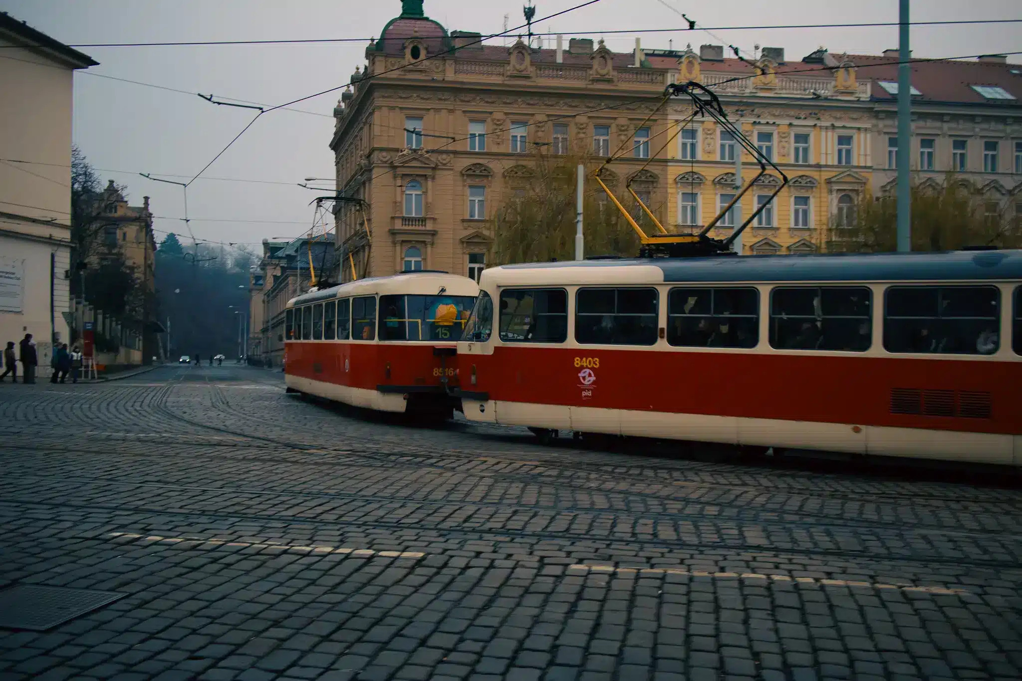
In many European cities, the tram is photogenic almost by accident. In Prague, it feels closer to a civic signature. The recurring red cars, the overhead wire geometry, and the way rails cut across stone-paved intersections all give transit a formal role in the streetscape. The tram is not a minor detail passing in front of historic facades; it is one of the main things organizing how those facades are seen.
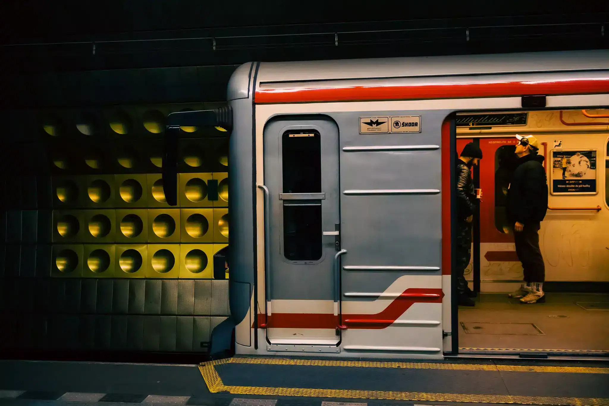
That visual coherence has been deliberately sharpened in recent years. Prague Integrated Transport, or PID, introduced a unified visual identity in 2021 for public transport across Prague and the Central Bohemian Region. According to PID, the red used in the system connects back to the traditional color of the iconic T3 tram, while light grey bodywork and vertical red door-zone accents were chosen for legibility and consistency. In other words, today’s branding does not erase older tram imagery. It quotes it, updates it, and scales it up into a metropolitan system serving around 3 million people across more than 600 lines.
That helps explain why the tram photographs feel so specifically Prague. They show more than rolling stock. They show a city comfortable with letting infrastructure remain visible, even charismatic. The wires are dense, the curves are tight, and the vehicles move through streets that still carry the texture of earlier centuries. Instead of trying to make transit disappear into a heritage setting, Prague lets the friction show. The friction is the point.
Malostranská shows how the metro became a design object
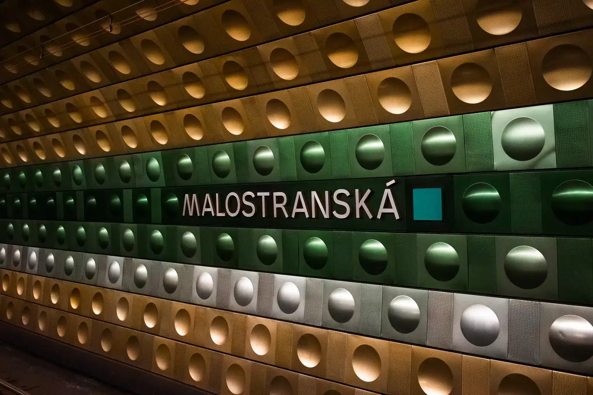
Below ground, the same logic continues in a different register. The image of Malostranská station makes an old argument feel fresh again: great transit systems are also graphic and architectural systems. Prague’s metro is often described as the backbone of the city’s public transport network, but that functional description misses how visually authored it is.
On Line A, the anodized metal tile interiors designed in the 1970s by Jaroslav Otruba gave stations a highly recognizable material language. At Malostranská, Prague City Tourism notes that the green color references the nearby Lesser Town gardens, which is a small but telling decision. The station is not just color-coded for abstraction; it is keyed to its surroundings. Even underground, the city leaks in.
The recognizability of the metro also depends on graphic design. Czechdesign credits Jiří Rathouský with the Metron typeface and a foundational role in the orientation system, later expanded through additional layers by Rostislav Vaněk. That combination — architecture, surface pattern, typography, navigation — is why Prague’s metro reads so cleanly in photographs. It has the legibility of industrial design, but also the confidence of public art. The station wall at Malostranská, with its repeating circular forms and metallic finish, still looks futuristic in that very specific late-socialist way that graphic designers and transit nerds can’t help loving.
It is worth being precise here: the station’s exterior forecourt near the Waldstein Riding School has separate authorship from the Line A interior language. But that distinction only reinforces the larger point. Prague’s metro is memorable because multiple design layers were taken seriously. The city did not build a purely technical machine and decorate it later. It built a system where movement and visual identity arrived together.
Bridges and embankments turn the Vltava into urban infrastructure
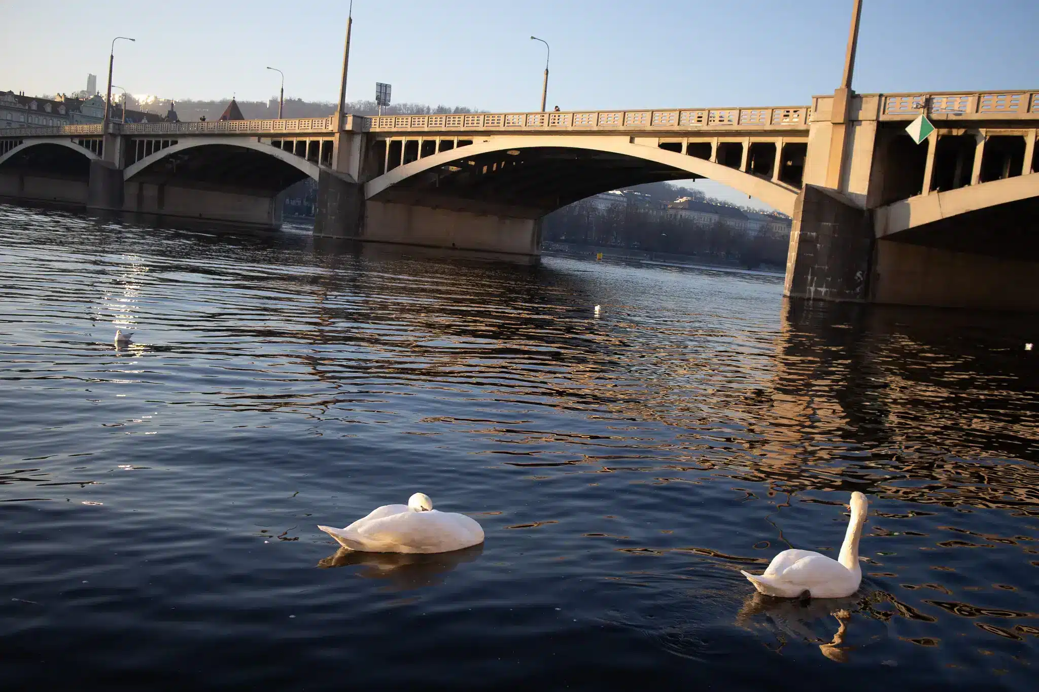
If the tram and metro explain Prague laterally and vertically, the river explains it structurally. The Vltava is not just scenery running through the center. It is a working corridor crossed by bridges, edged by embankments, and used as a space of circulation as much as leisure. That dual role comes through clearly in the photographs, where broad bridges, riverboats, stone edges, and winter light all keep the city in motion.
Charles Bridge is the famous example, but its importance is partly historical infrastructure rather than only symbolic grandeur. Prague City Tourism notes that it carried public transport until World War II and that cars stopped using it in 1965. That trajectory matters. One of Prague’s best-known crossings has been repeatedly adapted to different mobility regimes while remaining central to how people move through the city. Preservation here is not stasis; it is redesign by subtraction.
The embankments make a similar case in a more contemporary key. Rašínovo nábřeží, known as Náplavka, is now used year-round for markets, food, sport, and cultural events, while renovated vaults in the embankment wall house shops, cafés, and art spaces. Dvořákovo nábřeží functions both as a promenade and as a quayside for cruises and regular passenger connections. These are not leftover edges of the city. They are active interfaces where transport, commerce, and public life overlap.
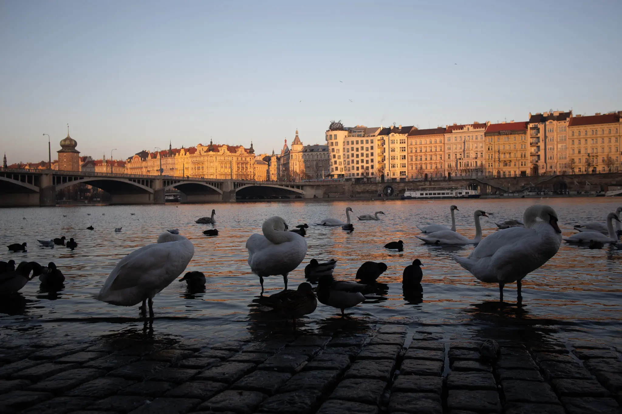
That overlap is especially sharp in winter. Seasonal stalls and warm food counters appear in central squares and along major pedestrian flows, but the riverfront remains one of Prague’s clearest reminders that the city was organized by movement long before tourism became its dominant image. Even the swans in these photographs work less as postcard filler than as a soft counterpoint to bridges, quays, and boats. Nature is present, but framed by systems.
Lucerna proves that circulation can also be cultural
The most revealing indoor image in the set may be the Lucerna arcade, because it expands the story beyond transport in the narrow sense. Lucerna Palace was built between 1907 and 1920 by engineer and businessman Václav Havel, grandfather of the later president, and both Prague City Tourism and Lucerna’s own history describe it as a pioneering passage building: a multifunctional urban complex combining culture, retail, entertainment, and movement.
That phrase — passage building — is the key. Lucerna is not just an ornate interior with a famous sculpture. It is a connector. People pass through it, meet in it, watch films there, eat there, and use it as part of the city’s indoor network. In a Central European winter, that kind of space matters. It turns circulation into an experience rather than a chore.
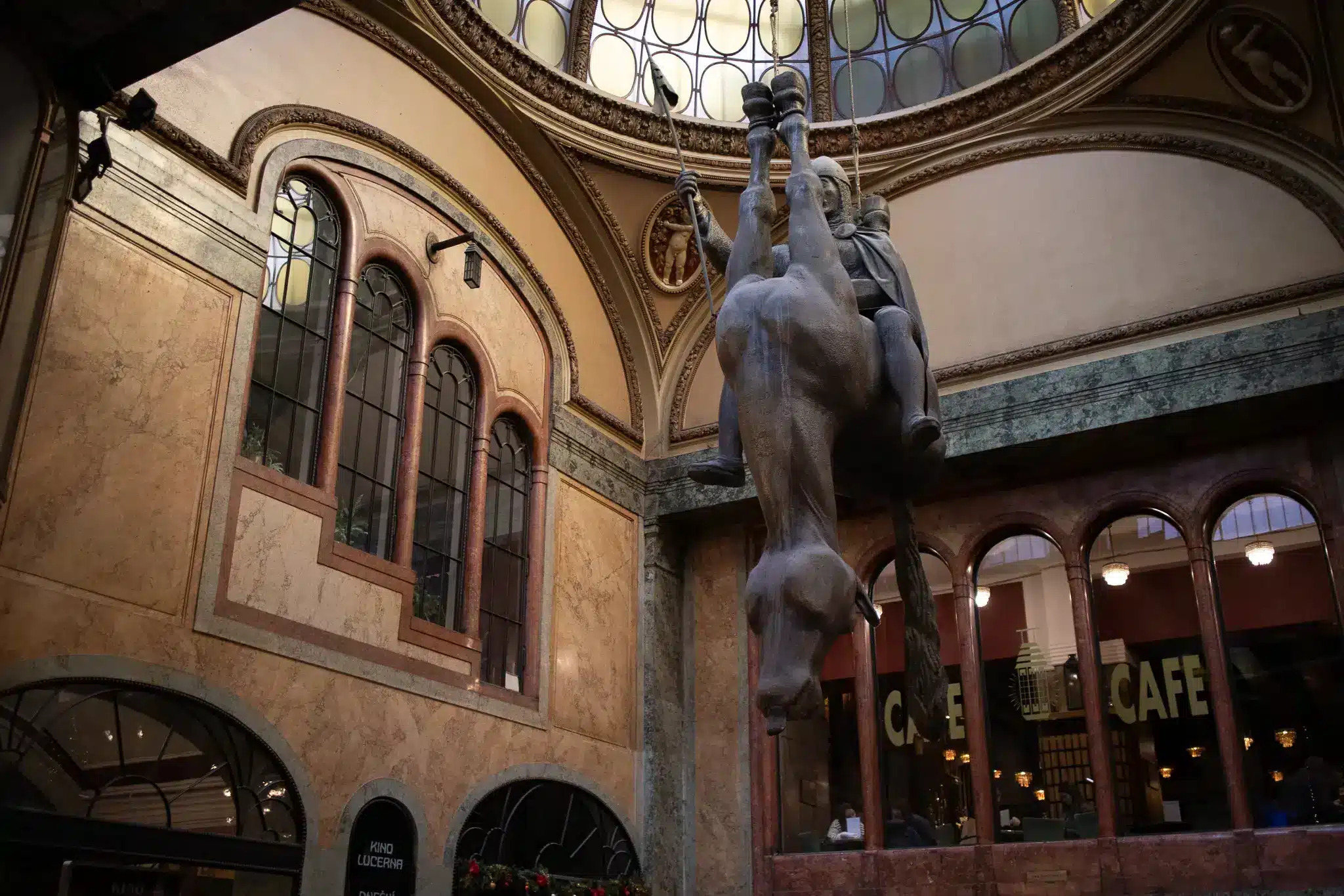
The upside-down horse by David Černý sharpens the point. The sculpture, first made for Exhibition CZ 99 and installed in Lucerna in 2000, is a deliberately unstable riff on the St. Wenceslas monument. Inside a heritage-heavy city, it introduces a prankish, skeptical note. Prague’s cultural identity is not all solemn architecture and preserved façades. It also includes satire, conceptual play, and a willingness to suspend reverence from the ceiling.
Seen alongside the tram and metro images, Lucerna belongs to the same story. It is another space built around passage, orientation, and urban flow — but with cinema, café culture, and surrealism folded in. Prague’s connective tissue is not purely mechanical. Some of it is theatrical.
Even the winter markets follow the city’s existing routes
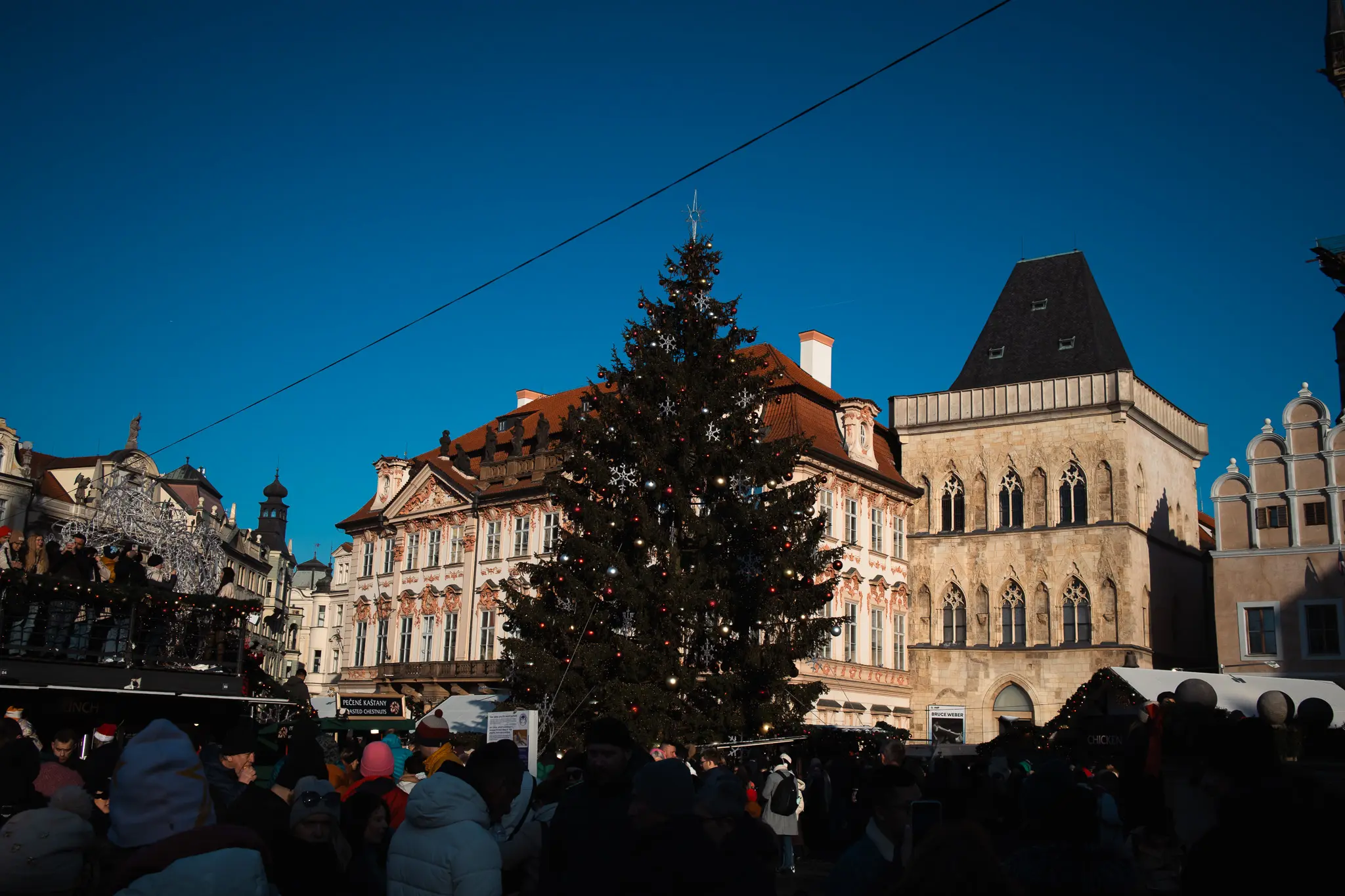
The December setting adds one more layer, but not in the usual sentimental way. The market scenes are less interesting as generic festive atmosphere than as evidence of how temporary commerce plugs into Prague’s established civic geography. Prague City Tourism’s listings and place pages show that major Christmas markets concentrate in central squares such as Old Town Square, Wenceslas Square, náměstí Republiky, and náměstí Míru. They appear where the city already gathers and circulates.
That is why roasted chestnuts, open braziers, and pastry stalls feel consistent with the broader theme. They are seasonal insertions into routes people are already taking. Radio Prague International lists mulled wine, Prague ham, roasted chestnuts, punch, and trdelník among common market foods, while also noting that trdelník is frequently marketed as traditional despite its more contested status. The point is less authenticity theater than visibility: these foods belong to the winter street economy of Prague whether or not every origin story survives scrutiny.
What the photographs catch well is the balance between the ceremonial and the ordinary. A large civic tree stands before major architecture; nearby, people queue for something hot to eat. Historic squares host temporary structures, bilingual signs, and improvised retail logic. Prague in December is not transformed into another city. It becomes more densely programmed, more illuminated, and more obviously public.
That may be the clearest takeaway from the whole set. Prague’s identity is not only in what has been preserved, but in how the city keeps using its inherited spaces and systems. Tracks, tunnels, bridges, arcades, quays, kiosks: each one moves people through the place, and each one leaves a visual trace. Put them together and Prague stops looking like a still image. It starts reading like a network.
Photography by Gil DeSaant. Explore more of his photography at gildesaant.com.