Liverpool is often flattened into a few over-rehearsed identities: port city, music city, football city. What stands out in this set is something more infrastructural and more revealing. The photographs keep landing on places where systems touch: the station concourse where rail hands off to taxis and buses, dock basins where preserved vessels sit against redevelopment, a ceremonial arch facing a domed civic mass, and central streets organized as much by signage and circulation as by architecture.
That makes this feel like a city of interfaces rather than icons. Even when familiar landmarks are present, they are rarely treated as isolated monuments. They appear as orientation devices inside a larger urban choreography—part transport machine, part commercial stage set, part archive of industrial names still hanging on adapted buildings.
Liverpool has long been shaped by exchange, movement and remaking, so this way of seeing the city is more than a visual quirk. Around Mann Island and Canning Dock, early-2010s redevelopment inserted dark glass volumes and a new museum into historic waterfront fabric on land already marked by wartime damage and repeated reuse. At Lime Street, Victorian train sheds now work alongside upgraded concourse space, retail, taxi access and airport-bus connections. The result is not a neatly preserved past or a frictionless present, but a city where the joins are visible.
Lime Street is less a landmark than an arrival machine
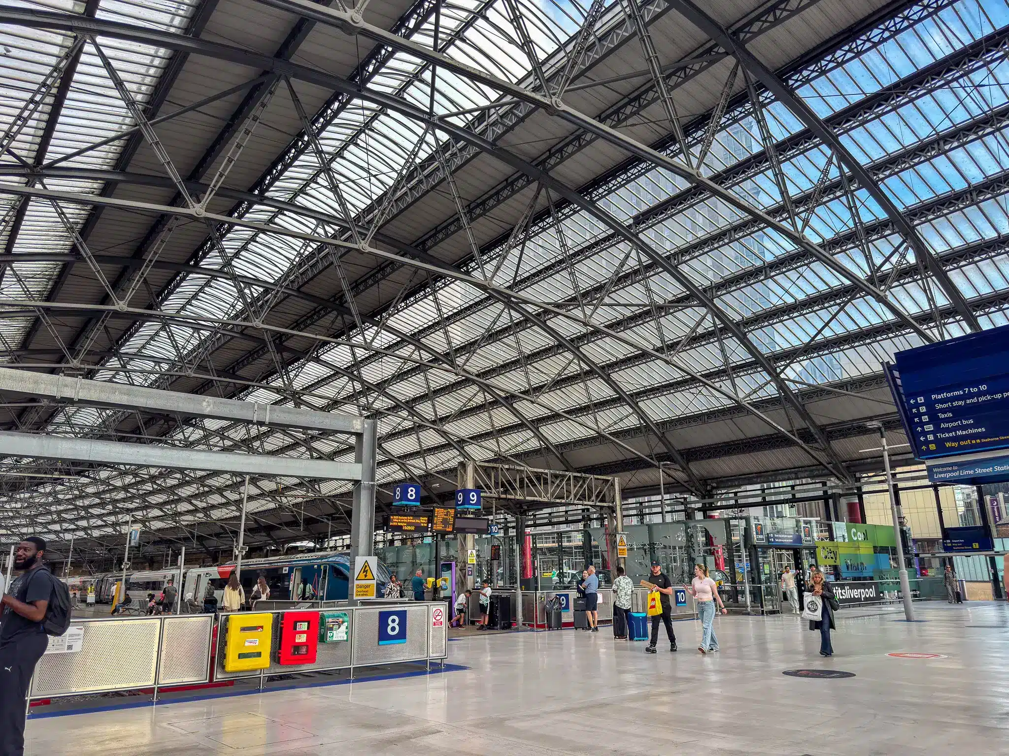
Liverpool Lime Street appears here in the way frequent travelers tend to remember major stations: not as a single heroic interior, but as a sequence of decisions. Platform numbers, way out signs, taxis, airport bus, ticket machines, onward travel. National Rail and Network Rail material make that reading literal. Lime Street is a major interchange linking mainline rail to local buses, Merseyrail connections, taxi ranks and walking routes into the centre, with airport buses leaving from Great Charlotte Street near the Skelhorne Street entrance.
That practical layer matters because it shifts the station from heritage object to operating interface. The iron-and-glass train shed is still doing the Victorian work of spanning movement at scale, but the city now meets it through updated concourse systems and retail logic. The recent programme of upgrades also reopened the station’s historic façade to Lime Street after the removal of Concourse House, a reminder that preservation in British transport hubs often means recalibrating how old fabric meets current passenger flow, not freezing it in amber.
In other words, the first face Liverpool presents is procedural. You read the city before you really see it: arrows, exits, pickup points, platform boards, transfer options. For a place so often packaged through myth, that feels refreshingly honest.
At Mann Island, Liverpool’s waterfront shows its arguments in public
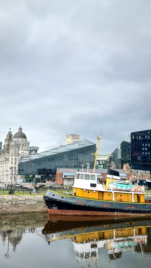
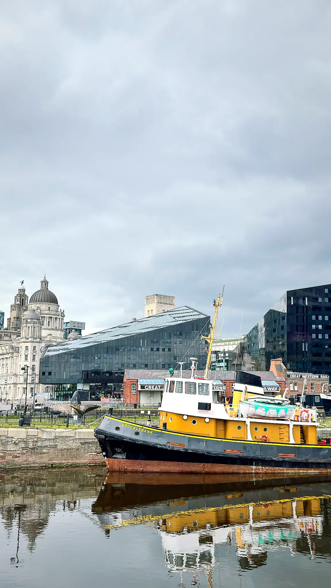
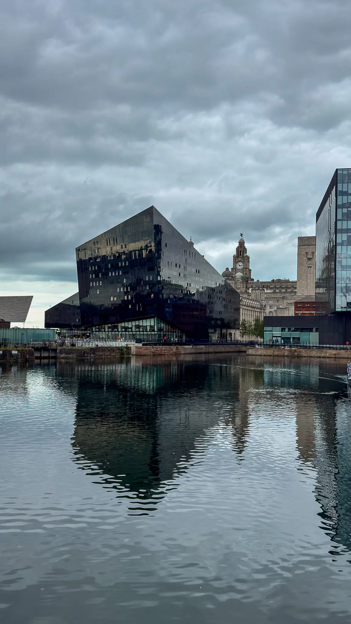
The dock scenes are strongest when they resist the lazy formula of old versus new. What the photographs actually show is more specific: the Mann Island and Canning Dock threshold, where preserved maritime objects, dock edges, museum infrastructure, reused warehouse buildings and early-2010s private development sit within the same visual field. UNESCO’s 2011 monitoring report described the Mann Island scheme as three blocks clad in black polished granite and dark glass, appearing like irregular black prisms on a transparent ground floor. That severe silhouette is exactly why the buildings still read less like background filler than a deliberate provocation on the skyline.
Those forms remain controversial for good reason. They were part of a regeneration push beside the Pier Head, yet they also created a hard dark counterpoint close to one of Britain’s most symbolically loaded waterfront ensembles. In these photographs, that tension is productive. Liverpool doesn’t look embalmed as a heritage port. It looks like a place still negotiating what should remain legible from its mercantile past and what kind of architectural language is allowed to speak next to it.
The boats sharpen that argument. Brocklebank is not just a nice bit of dockside character; it is a preserved tugboat under the care of National Museums Liverpool. The Pump House, meanwhile, carries industrial naming into the present through adaptive reuse, now functioning as a pub in a former hydraulic pumping station. Even leisure craft on the water complicate the scene. Workboat, heritage vessel, hospitality venue, pleasure boat, museum district, luxury-adjacent glazing: the waterfront is not one story, and Liverpool is smart enough not to pretend otherwise.
Nelson Street turns a ceremonial gate into urban conversation
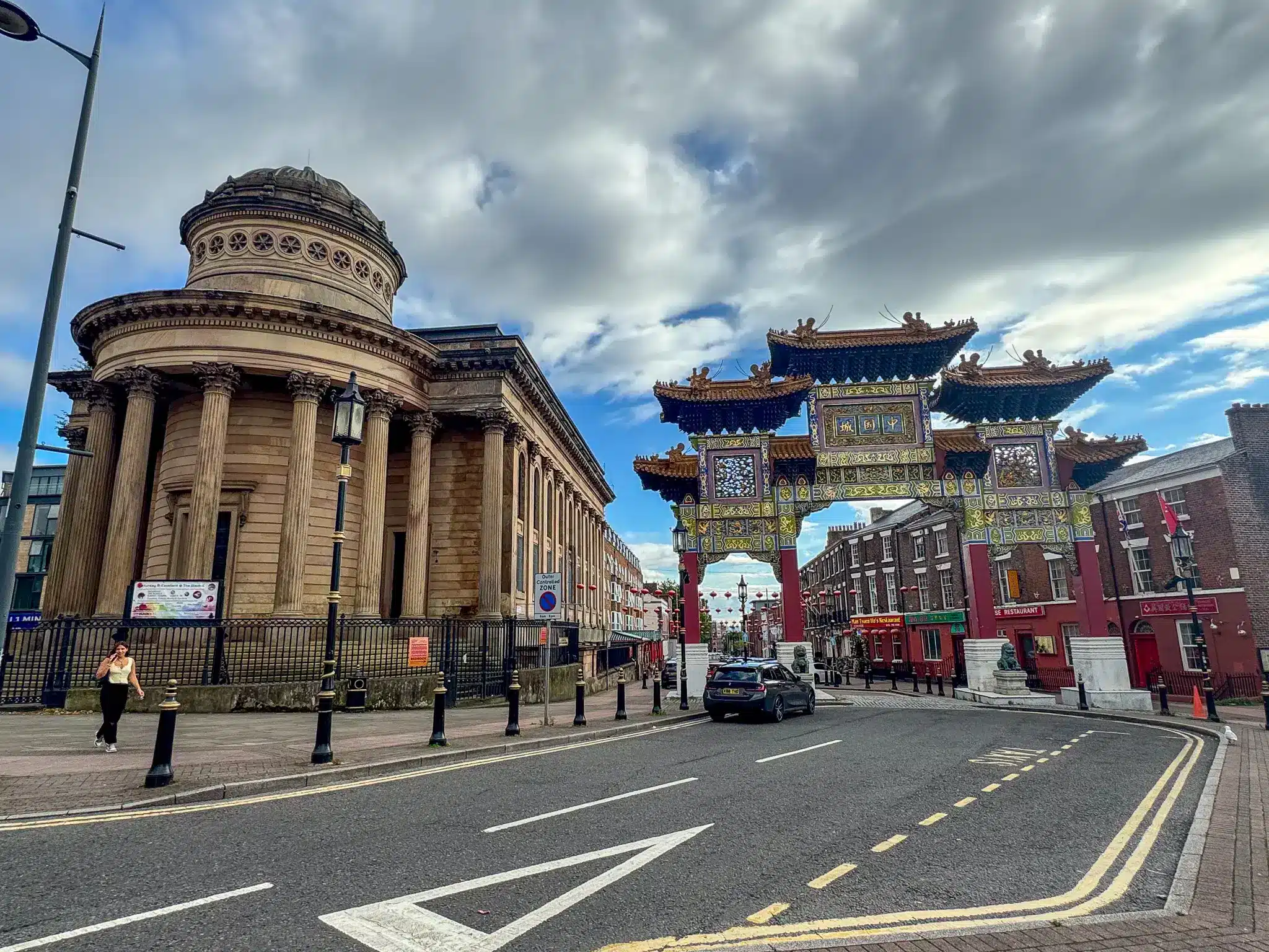
The Chinatown images work because they do not isolate the arch as an exotic token. Instead, the gate is framed in direct relation to the city around it, especially the domed neoclassical building opposite. That juxtaposition makes a sharper point than the usual tourist framing. Liverpool’s Chinese ceremonial arch on Nelson Street, assembled in 2000 for Chinese New Year, is both a marker of identity and a product of city-centre remaking, delivered through cooperation between local Chinese business groups and civic institutions.
That context matters because Liverpool is home to Europe’s oldest Chinese community, according to Liverpool City Council. The gateway therefore reads as more than decorative branding. It is a visible statement of continuity inside a central urban landscape that has repeatedly been reorganized by commerce, planning and redevelopment. The red lanterns further down the street extend that identity into the everyday commercial corridor beyond the arch itself.
What makes these frames compelling is the refusal to treat different architectural languages as mutually exclusive. The Chinese gateway, the classical drum and dome across the road, the traffic controls, the restaurant signage and the standard British street furniture all occupy the same civic sentence. Liverpool is saying something important here: cultural visibility in the city centre is not outside the formal city. It is part of it.
Cathedral wayfinding and poster walls give the centre its operating system
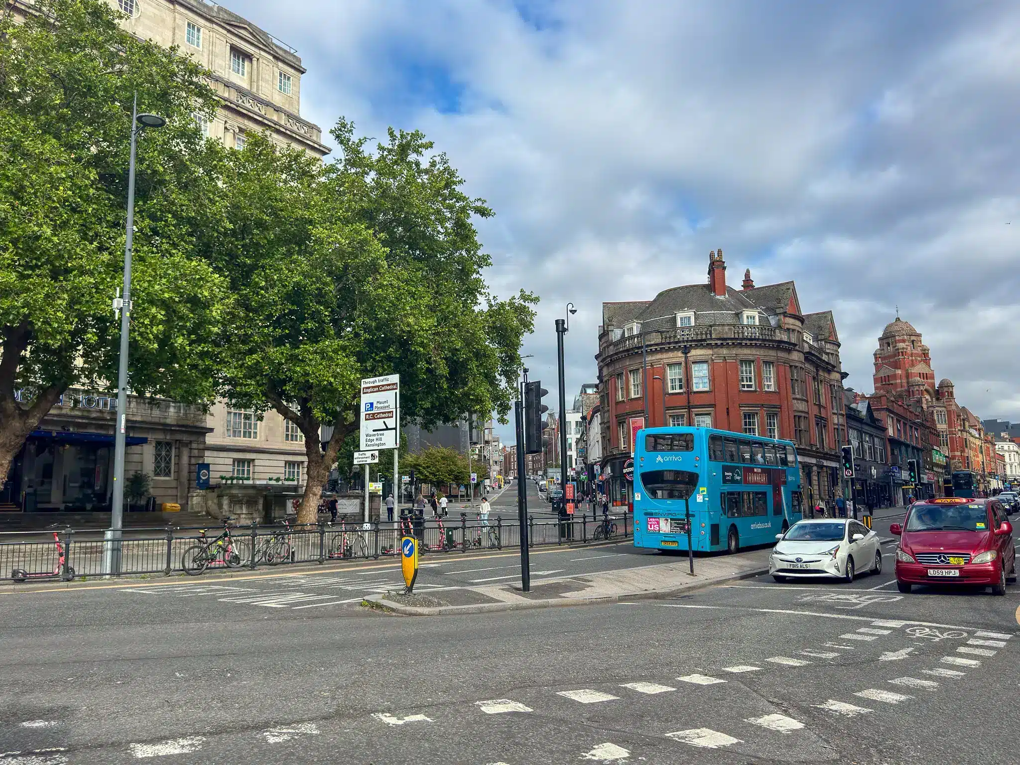
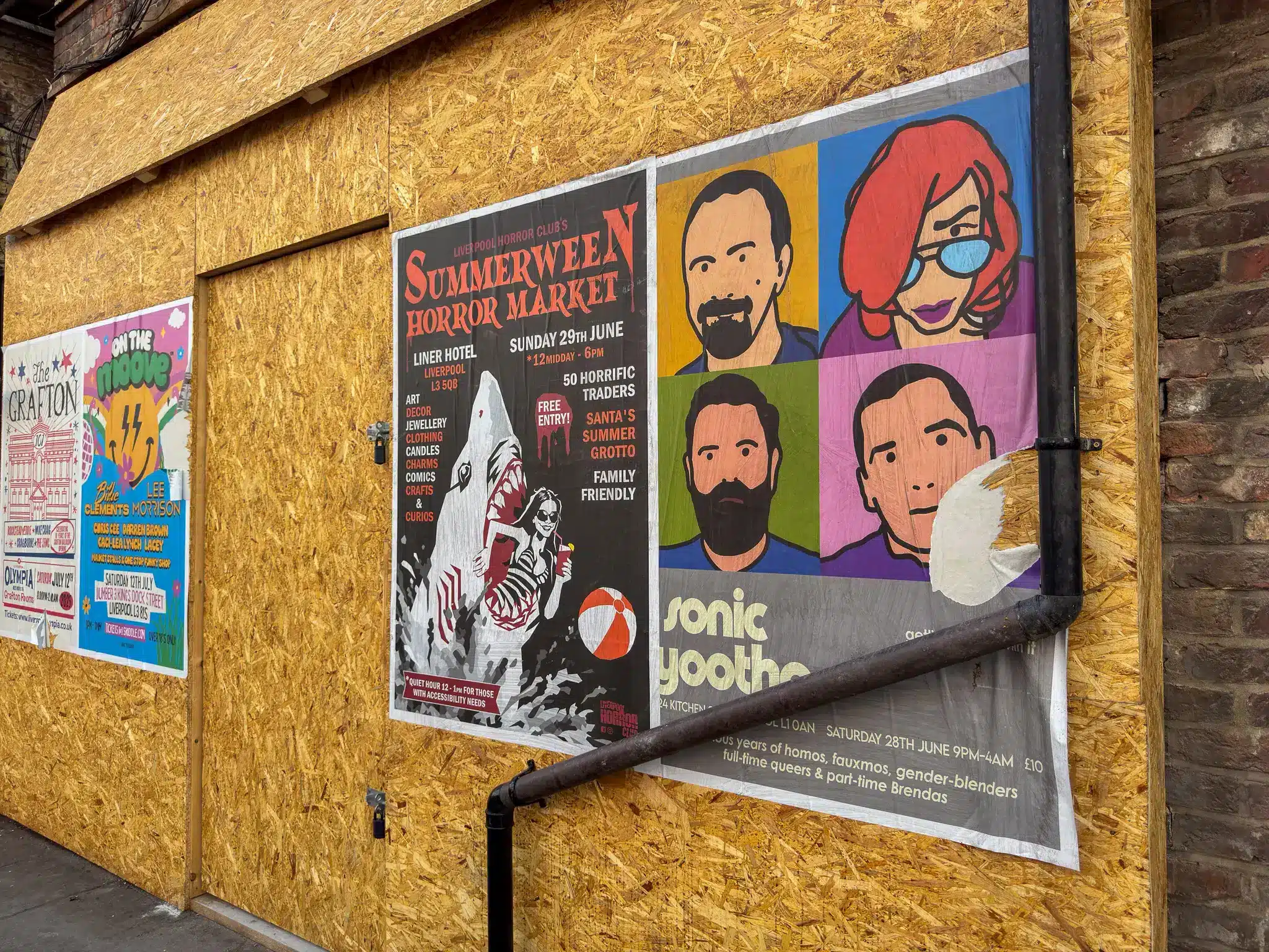
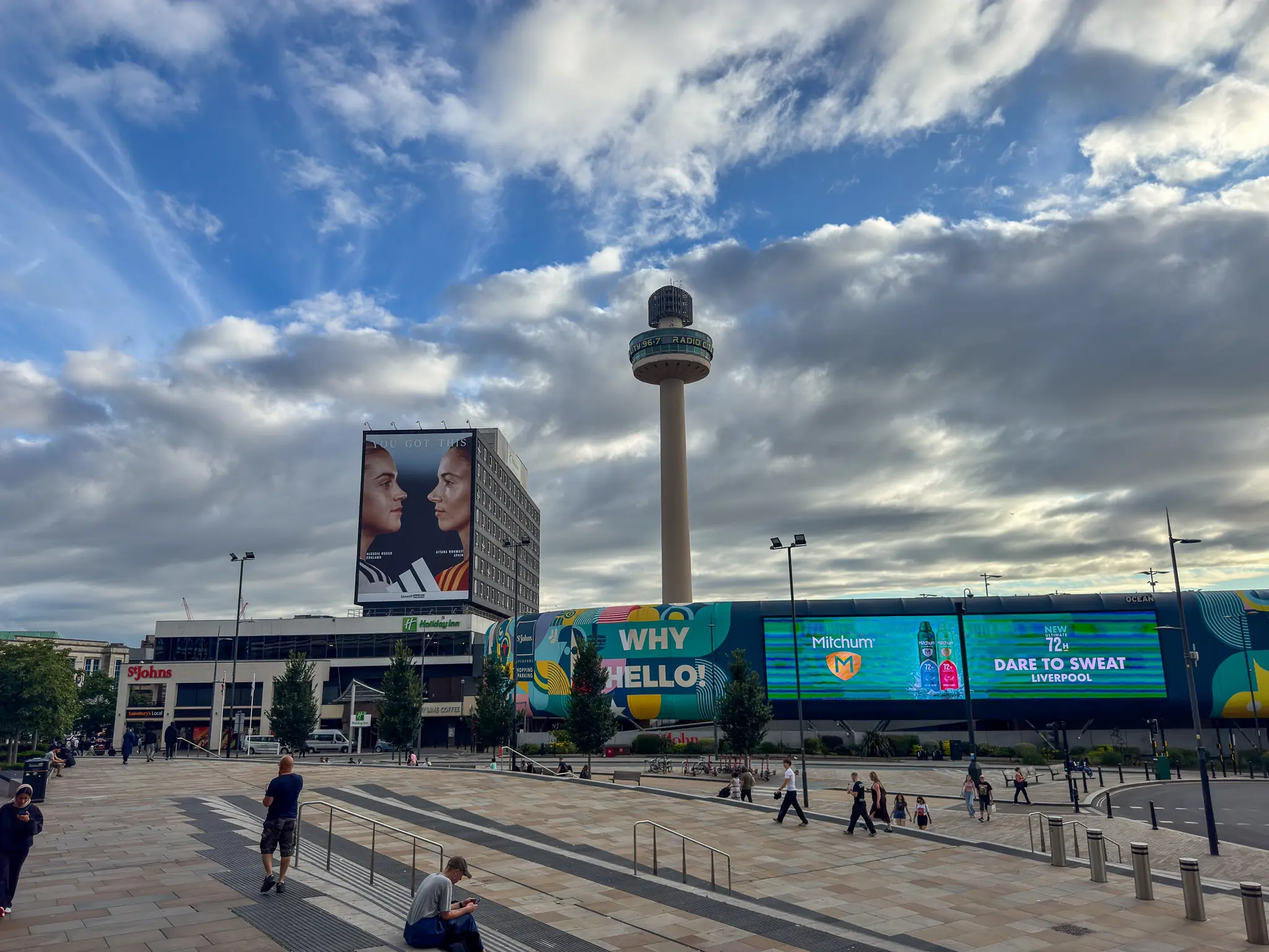
Some of the most telling images in the set are basically about text. Direction signs point toward the Anglican Cathedral and the R.C. Cathedral. The RADIO CITY tower brands the skyline. St Johns, Great Western, The Pump House and event posters all compete for attention across different scales. Typography in Liverpool is not decoration in these scenes; it is urban infrastructure.
The cathedral references are especially good at showing how local orientation works. The city’s two cathedrals are not merely attractions but real geographic anchors in central Liverpool. Hope Street is explicitly framed by Liverpool Cathedral itself as the link between them, and visitor material for the Georgian Quarter treats the pair as bookends to the area. So when road signs direct traffic by cathedral, that is not a quaint flourish. It is the city using civic and religious architecture as navigational hardware.
The postered boarded frontage adds another layer. It would be easy to overread a temporary boarded site as some grand statement about urban decline, but the more convincing story is graphic culture in action. Horror-market flyers, club listings and venue promotions suggest a city whose cultural circulation still happens on walls as much as on screens. Anyone raised on record-shop windows, gig posters and pirate-radio aesthetics will recognize the energy immediately. Liverpool’s centre is not only mapped by permanent architecture; it is also patched together by temporary messages.
Between Bold Street and the plaza, everyday commerce does the cultural work
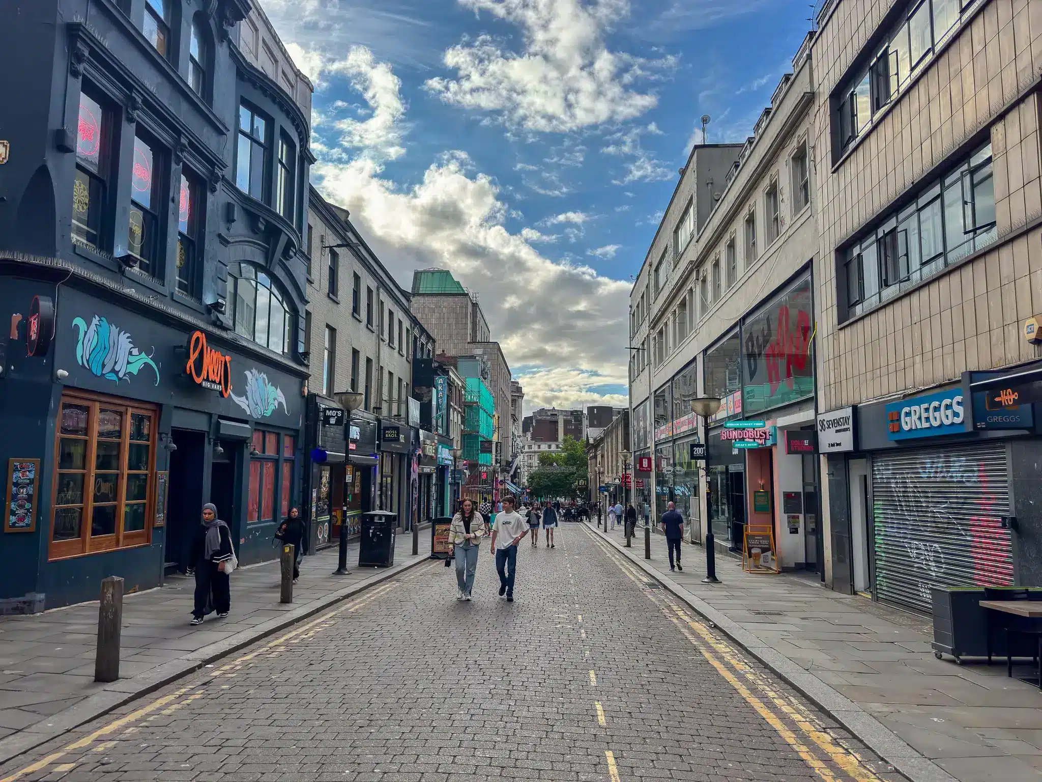
The street scenes move between at least two different central-city conditions. One is the more independent food-and-nightlife corridor associated with Bold Street and the Ropewalks, where Bundobust identifies its Liverpool venue as overlooking what it calls the city’s independent food and drink capital. The other is the more managed retail-plaza environment around Liverpool ONE and St Johns, where open paving, chain signage, digital screens and controlled pedestrian flow produce a very different rhythm.
Seen together, they show how Liverpool’s centre is stitched from overlapping commercial cultures rather than one coherent brand experience. On one block, small food businesses and bars announce themselves through layered storefront typography and improvised visual identity. On another, giant advertising panels and landmark media structures like RADIO CITY turn public space into a broadcast surface. Neither cancels the other out. They are adjacent systems for moving people, money and attention.
The food retail details matter precisely because they are ordinary. A Chinese bakery, halal takeaway signage, burrito bars, Greggs, pubs, outdoor seating, convenience retail: this is not a city reduced to destination dining. It is a city whose street-level life is carried by practical, repeat-use places. That may be the set’s most persuasive idea overall. Liverpool appears not as a sequence of headline attractions, but as a working urban interface made legible through stations, signs, boats, gates, roads and shopfronts—the places where the city explains itself while you are on the move.
Photography by Gil DeSaant. Explore more of his photography at gildesaant.com.