Barcelona is often flattened into a familiar sequence of attractions, the kind that fit neatly onto fridge magnets and airport bookstore covers. This set pushes in a different direction. Its recurring subject is not monumentality alone, but assembly: cranes clipped to basilica spires, arrows on tiled station walls, platform numbers, bus destination boards, kiosks, scooters, marina masts, the long horizontal grammar of a beach reached through urban circulation. The city appears here as a public machine, never exactly hidden, never exactly finished.
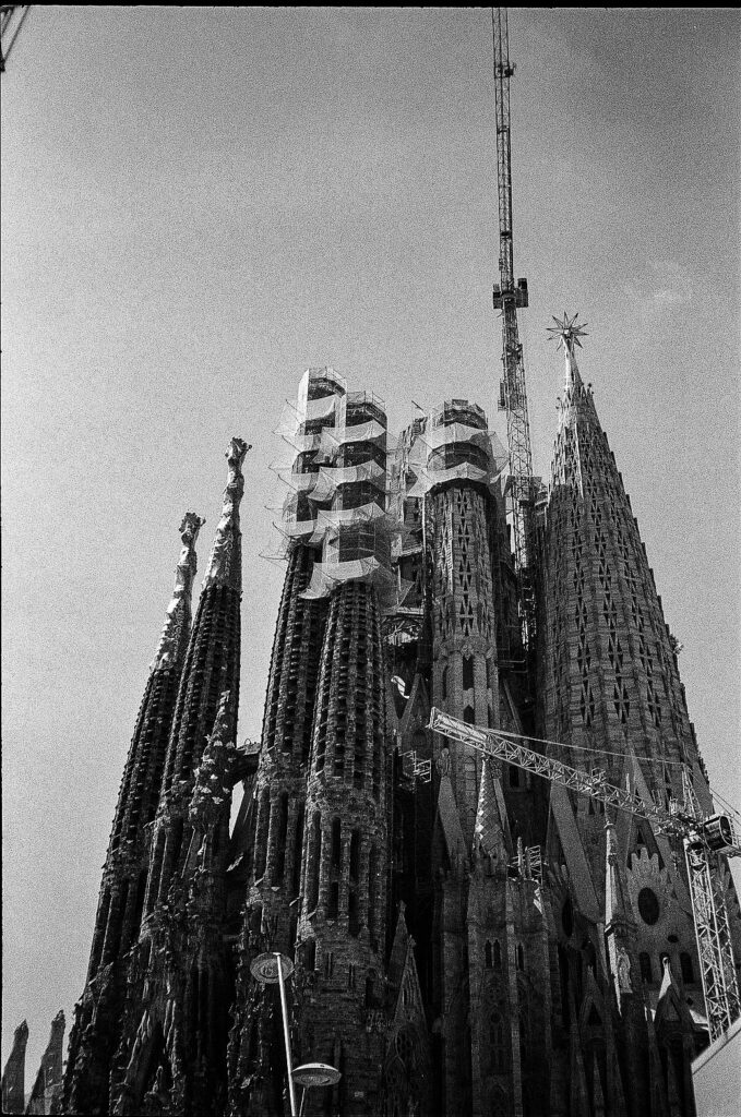
The clearest example is the Sagrada Família, photographed not as a completed icon but as an argument for incompletion. In image after image, Gaudí’s stone verticals share the frame with scaffolding, mesh, and cranes. That matters. By 2022, work on the basilica was focused on completing its central towers, not merely preserving a static masterpiece. Official basilica history notes that during that year the towers of the Evangelists Luke and Mark were completed, while the tower of Jesus Christ rose to its eighth of twelve levels, reaching 125.85 meters. The star visible high above the skyline belonged to the tower of the Virgin Mary, newly crowned in late 2021 and illuminated that December. So the skyline in these frames was not timeless Barcelona. It was a very specific, recently updated version of it.
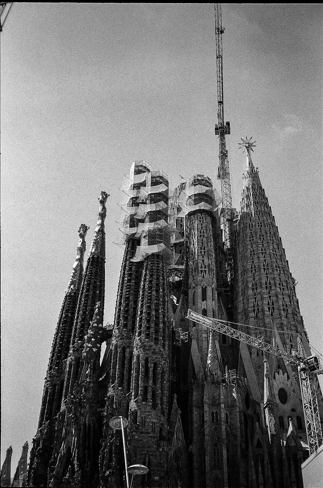
That distinction gives the basilica a different charge. The Sagrada Família is usually consumed as symbol; here it behaves more like infrastructure. The sacred form remains intact, but construction logistics are inseparable from its meaning. The cranes are not an annoyance to crop out. They are part of the building’s truth. In black and white, the usual color cues fall away and the eye goes to the harder stuff: perforated surfaces, wrapped sections, the tension between carved stone and temporary steel. It feels less like a devotional image than a study in systems engineering with theological ambitions.
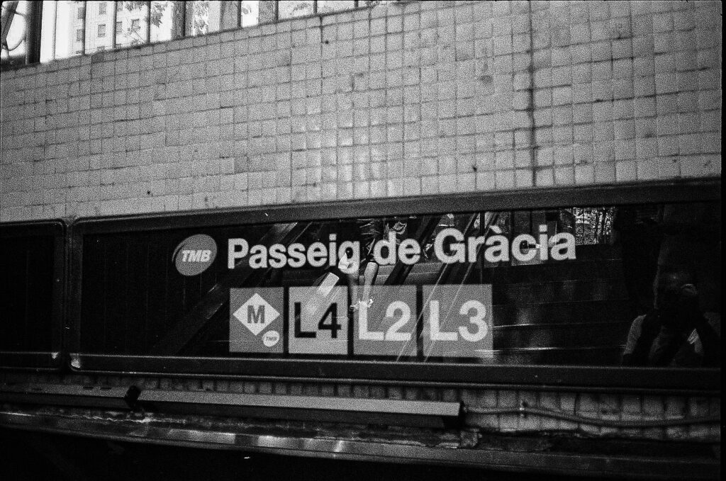
Once that pattern locks in, the rest of the set starts to rhyme with it. The metro images are especially sharp on this point because they pay attention to names and signs rather than generic underground atmosphere. Passeig de Gràcia, Trinitat Nova, Mercat de Sant Antoni, Barceloneta: these are not abstract notions of movement but tagged nodes in a legible network. Barcelona’s metro is designed precisely to make that network readable. TMB identifies lines through a strong color-and-number logic — L1 red, L2 purple, L3 green, L4 yellow, L5 blue — and its own materials emphasize contrast, hierarchy, and rapid orientation. Even the typeface matters. TMB has publicly noted the use of Helvetica across metro signage, a choice that says a lot about the city’s visual pragmatism. It is the familiar international modernist solution, still doing quiet work in a dense urban environment.
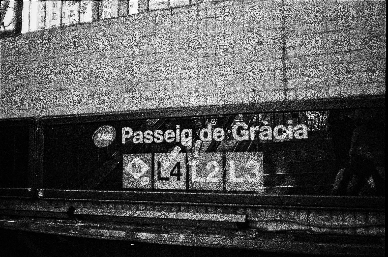
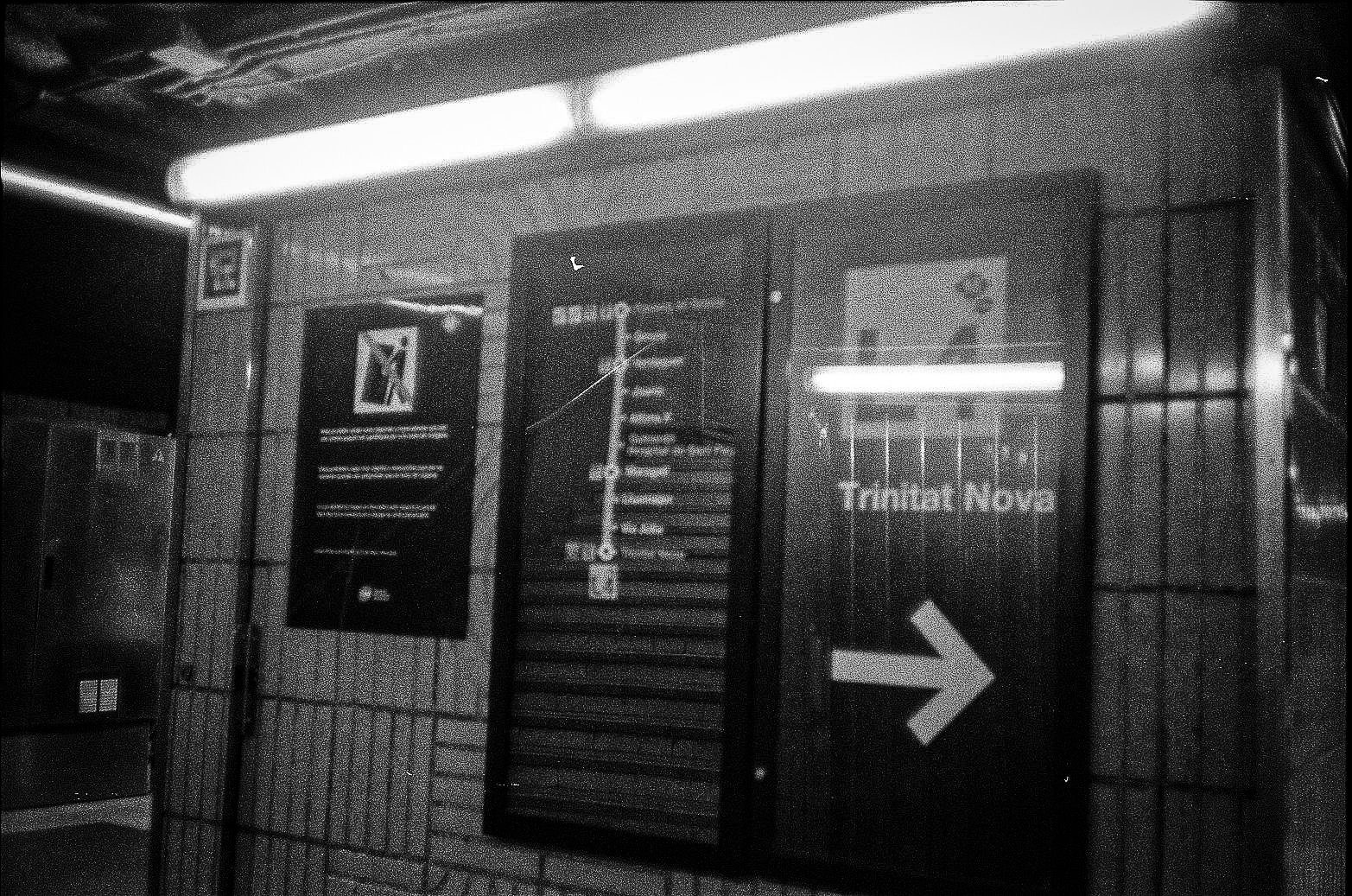
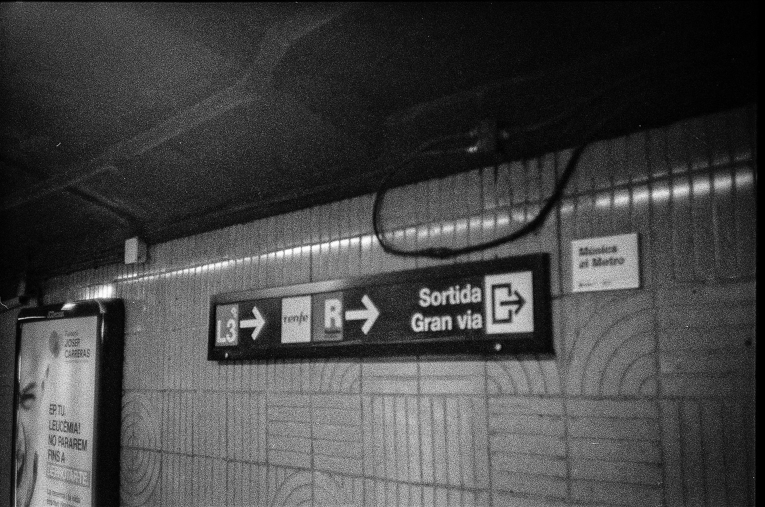
Typography becomes one of the set’s most useful documentary tools. Not just in transit, either. The pictures repeatedly notice text-bearing surfaces: station signs, route symbols, retail names, sale language, platform numbers, global food branding, bus boards. A Catalan retail message like Fins al -60% lands differently than a souvenir-shop approximation of place; it situates the city in its everyday language environment. Elsewhere, FNAC, GUESS, McDonald’s, Magnum, Oreo, and Nestlé sit inside the same visual field as station arrows and bus windows. That combination is contemporary urban Europe in a nutshell: local naming systems and global commercial shorthand sharing the same corridor.
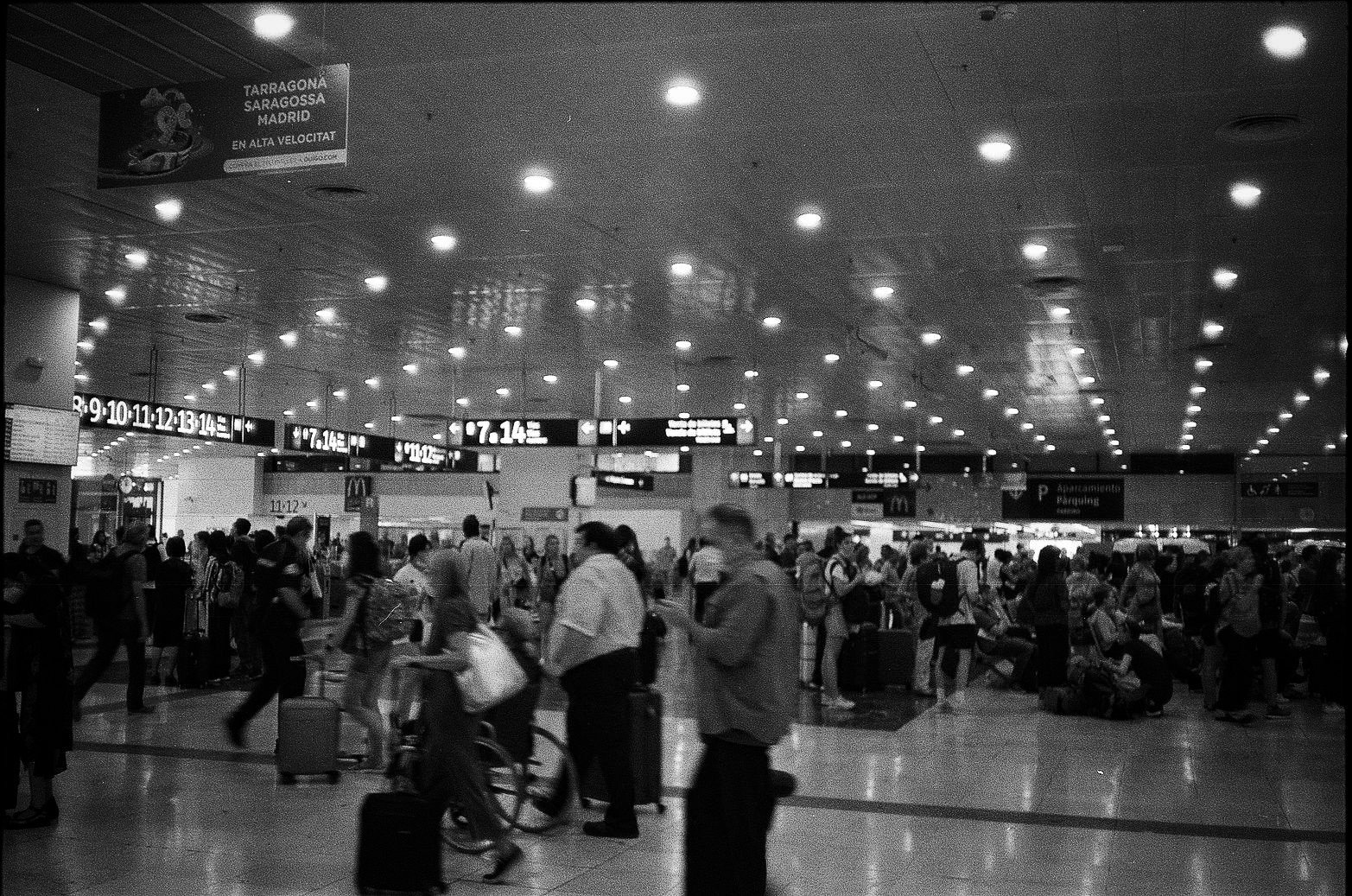
The rail images scale the story up. One station interior, very likely Barcelona Sants, opens onto the wider geography beyond the city: Tarragona, Zaragoza, Madrid, alta velocidad. Another frame shows the sleek, aerodynamic noses of high-speed trains under a glass-and-steel roof. If Gaudí represents one era of engineering spectacle, the AVE platform represents another. Barcelona Sants is the city’s principal rail station and a major node for high-speed, long-distance, medium-distance, and commuter services; Adif also describes it as a station in active transformation. That makes it a fitting counterpart to the basilica. Both are places people treat as destinations. Both are also work sites in a broader sense, subject to extension, upgrading, and logistical rethinking.
There’s something pleasingly unsentimental about the way these transit halls are photographed. Luggage accumulates. People wait beneath low ceilings and fluorescent strips. Overhead signage competes with chain-food logos. The scene could be almost anywhere in the networked twenty-first century except for the place names, which keep anchoring it back to Catalonia and central Spain. That tension is part of the point. Movement hubs standardize experience even in cities with strong local identities. You can feel the same flattening in airports, rail stations, and mall food courts from Osaka to Rotterdam to Atlanta. Barcelona isn’t exempt. It just wears the overlap more interestingly.
At street level, the city is less about one dominant mode than about constant switching. Scooters line plazas. Taxis idle at the edge of pedestrian space. Buses slide across tree-lined boulevards. Cyclists move along the waterfront. Pedestrians cross, wait, reroute, gather under shade. Several of the square and boulevard images suggest that public space here functions not simply as scenery but as transfer surface: a place where walking becomes waiting, where leisure becomes access, where a shopping street is also a transport corridor. That interpretation fits broader mobility patterns in and around Barcelona, where public transport and active mobility carry particular weight close to the city core, while private vehicle use becomes more dominant farther out.
The bus marked for Barceloneta is one of the set’s best little connectors because it links urban circulation to the coast without romanticizing either. Barceloneta is not presented as escape from the city; it is one more destination within the same operating system. That logic continues at the waterfront, likely around the Port Vell and Barceloneta side, where masts, promenade edges, palm lines, cyclists, and breakwaters echo the same linear order seen in tracks, catenary, and overhead wires. Official port material describes Port Vell as both public space and a zone where urban, commercial, and maritime functions coexist. In other words, it is not just a pretty edge condition. It is working city fabric.
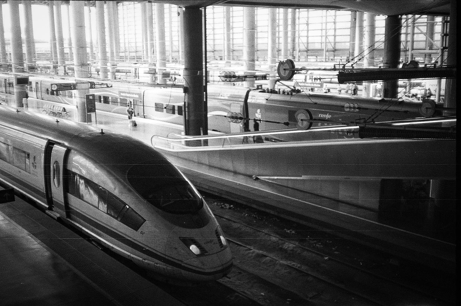
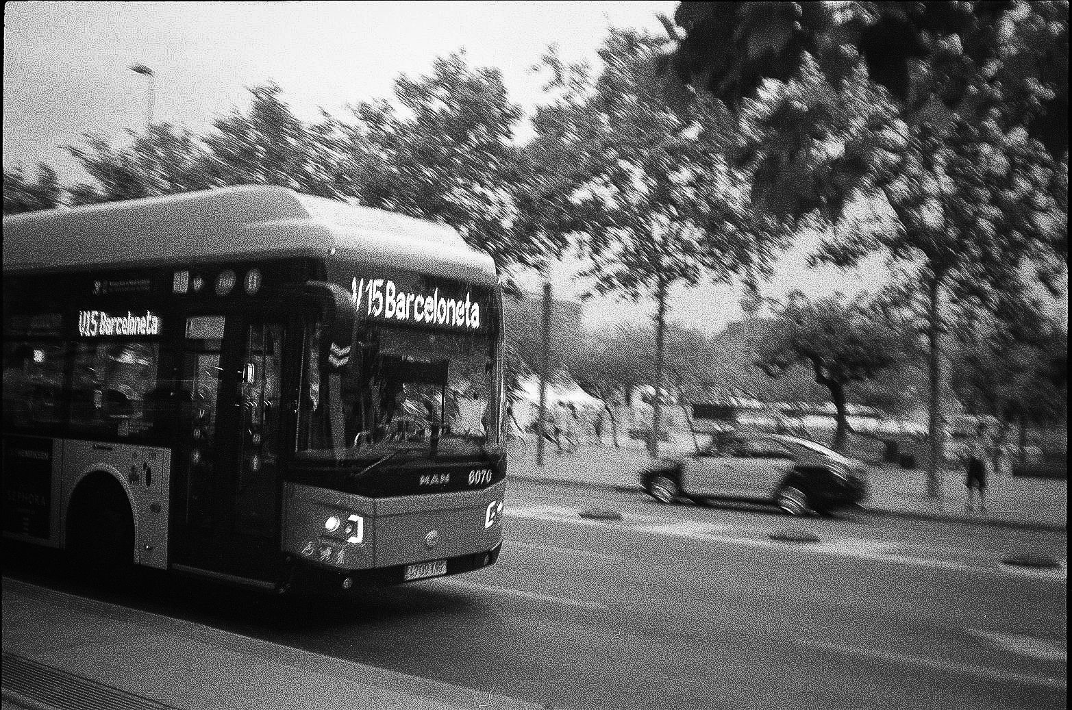
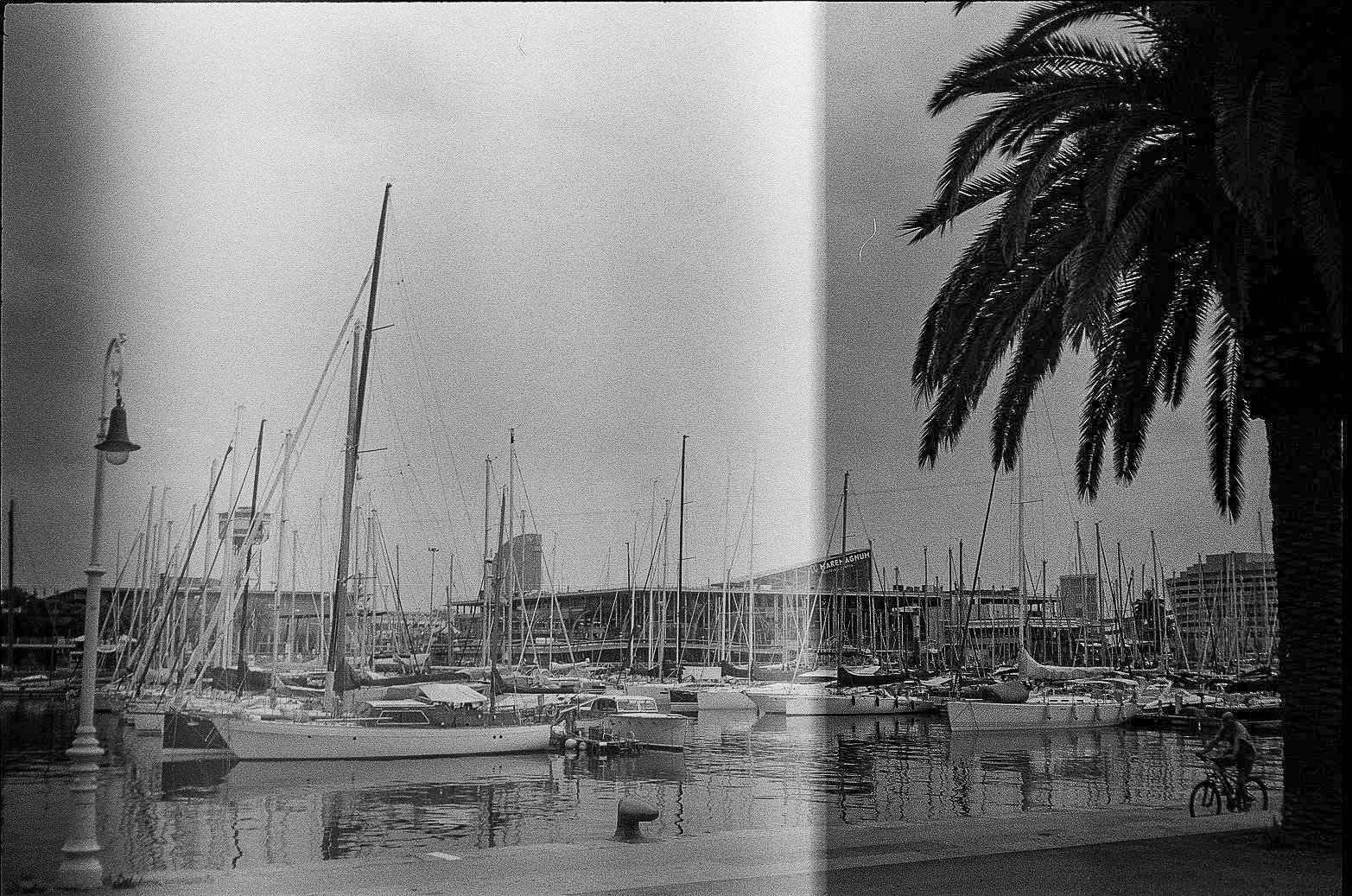
The beach photos are useful for the same reason. They are not chasing Mediterranean fantasy. The emphasis is on distribution: bodies spread across sand, the engineered line of the breakwater, the open civic relief of shoreline at the edge of a dense metropolis. Reached by bus, metro, foot, bike, or promenade, the beach becomes part of Barcelona’s circulation system too. Public leisure here is inseparable from public access.
Even the open-top sightseeing bus, usually the quickest route to lazy travel writing, gets folded back into the larger machine. In this set it appears behind a kiosk crowded with product logos and ice cream branding, less a glamorous vehicle than another layer of organized throughput. TMB describes the Barcelona Bus Turístic as the city’s official hop-on, hop-off sightseeing service, which makes it a formal piece of transport infrastructure as much as a tourist novelty. The frame understands that. Tourism is not outside the system; it rides on the same streets, stops at the same curbs, and buys snacks from the same branded counters.
Seen this way, Barcelona looks less like a finished masterpiece than a city permanently tuning itself in public view. The basilica still climbs. Stations keep sorting bodies through line colors and arrows. Rail halls advertise the rest of the peninsula. Promenades convert port land into civic space. Beaches absorb the overflow. Everything connects, but nothing quite settles.
That may be the most honest image of the city. Not Barcelona as backdrop, but Barcelona as process: designed, routed, repaired, expanded, commercialized, inhabited. An unfinished machine, still running.