Most photo sets from Barcelona default to the familiar hierarchy: Gaudí first, beach second, street life as filler between the two. These images do something more interesting. They treat the city as a circulation system. Barcelona appears here not as a sequence of attractions but as a mesh of platforms, sidewalks, retail fronts, station walls, taxi stands, bus displays, scooters, concourses, and shoreline promenades. Even its most famous landmark enters the frame less as an isolated icon than as one stop within a larger choreography of getting around.
That reading feels true to the city itself. Barcelona is unusually legible in motion. The public realm is structured by named routes and visible interfaces: metro entrances marked by TMB branding, buses that announce coastal destinations, broad boulevards that double as shopping corridors and transport spines, and waterfront edges that function as leisure space without ever fully detaching from the urban grid behind them. In black-and-white film, all of this flattens into the same tonal language. Stone facades, fluorescent wayfinding, train carriages, palm-lined marina paths, and snack kiosks sit in one visual continuum.
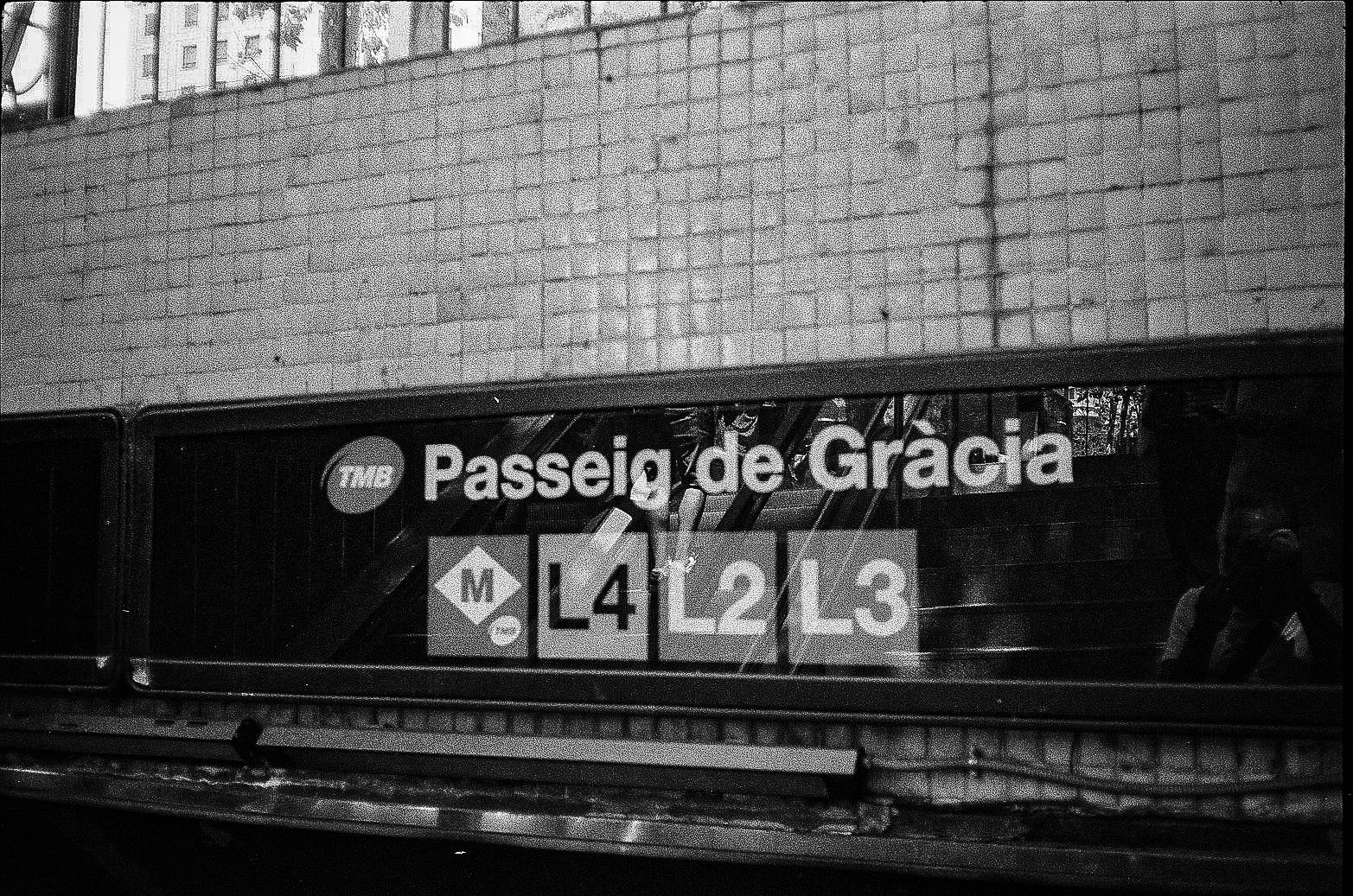
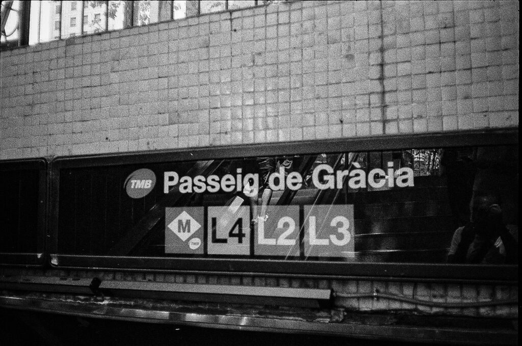
The station sign for Passeig de Gràcia makes that continuum explicit. Officially, it is not a minor stop but a true interchange, served by metro lines L2, L3, and L4. That matters because Passeig de Gràcia is also one of Barcelona’s signature boulevards, linking Plaça Catalunya toward Gràcia while carrying both major modernista architecture and high-end retail. UNESCO-listed Casa Batlló and Casa Milà stand along the same corridor where commuters read line markers and follow tiled arrows. In other words, one of the city’s best-known architectural promenades is also a transfer machine. The photos understand this instinctively: polished surfaces, branded storefronts, station graphics, and movement through shade are all part of the same urban sentence.
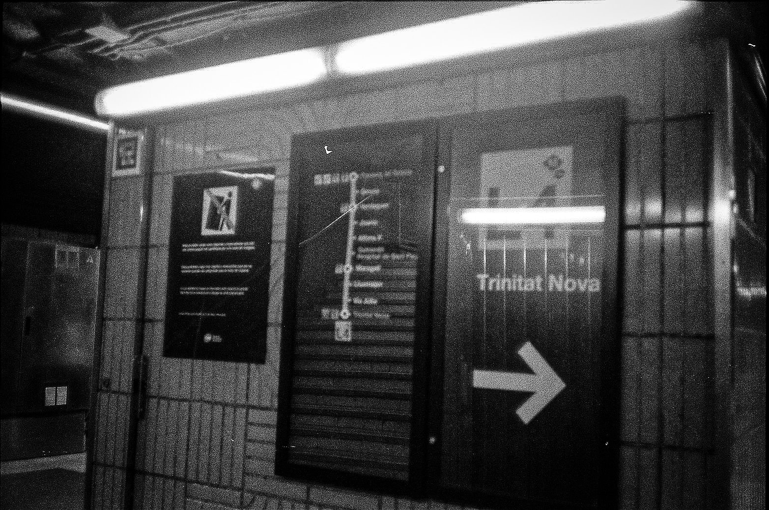
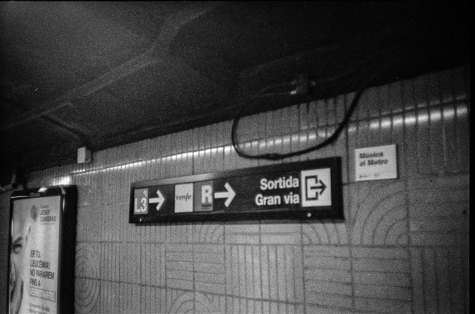
That sentence continues underground. Another frame isolates the name Trinitat Nova on a station wall, reducing the city to typography, tile, and direction. Trinitat Nova sits far from the central visitor core and is served by L3, L4, and L11. Its appearance in the set expands the map. Barcelona is not being pictured only through its ceremonial center; it is being registered as a network with depth, one where peripheral nodes and central interchanges belong to the same system. A separate sign pointing toward Mercat de Sant Antoni and Gran Via adds another layer of specificity. Sant Antoni is on L2, and the wording ties metro movement directly to neighborhood orientation rather than monument-chasing. The city comes into focus through names you follow.
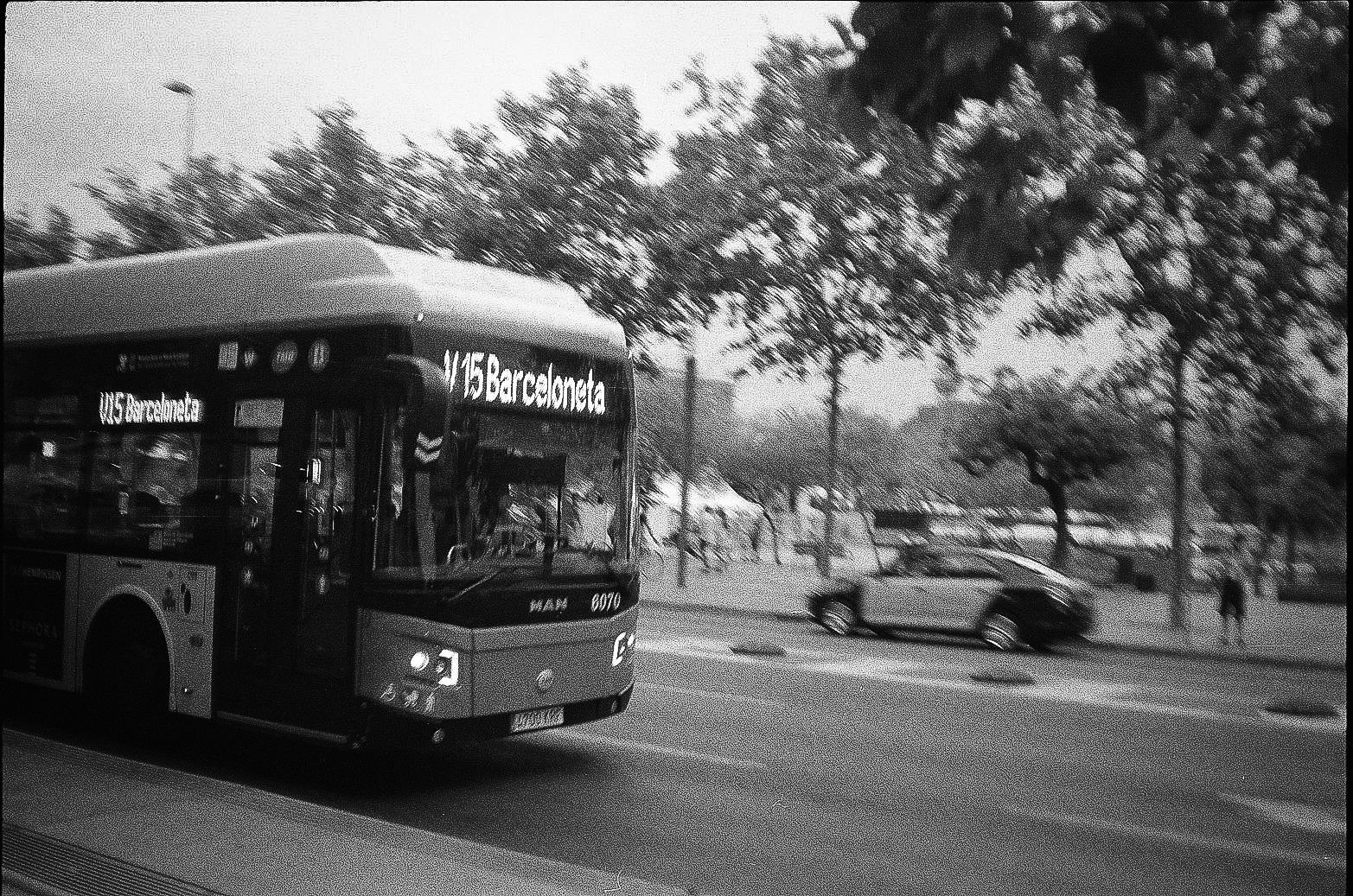
That may be why the bus image lands so well. Its destination display reads Barceloneta, a word that does double duty in Barcelona: neighborhood, coast, urban edge, shorthand for getting to the water. TMB’s own network material confirms Barceloneta as both a metro destination on L4 and a bus destination on routes including the V15. That overlap matters. The beach is not separate from the city’s daily mechanics, and certainly not outside them. It is embedded in the same web of practical wayfinding that connects stations, streets, and interchanges. The bus doesn’t symbolize escape from the city; it shows the city extending itself to the shoreline.
The beach frames reinforce that point by refusing postcard theatrics. What stands out is not romance but distribution: bodies spaced across sand, a low horizon, public openness, the edge condition where a dense city releases into weather and water. Barcelona’s waterfront redevelopment long ago turned the seafront into one of the city’s most visible public surfaces, but these pictures keep that fact grounded. Leisure here is infrastructural. People arrive by metro, bus, bicycle, scooter, or on foot; they occupy the beach the way they occupy plazas and promenades, as part of a larger system of shared urban space.
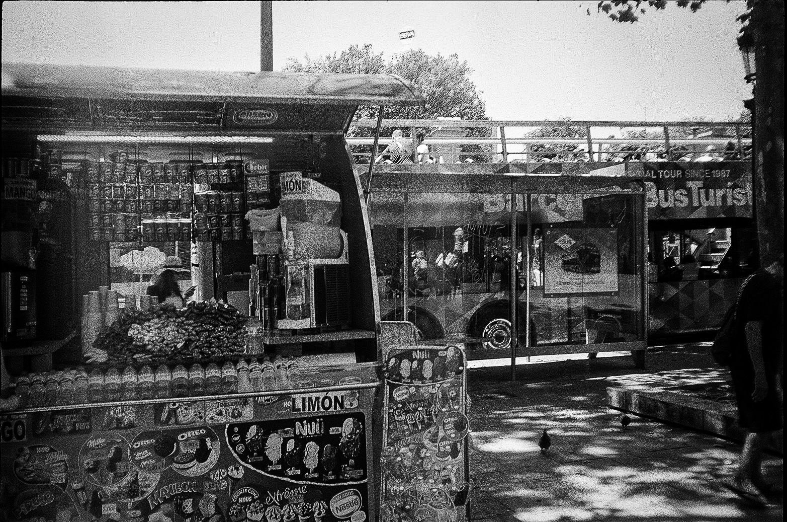
The same can be said for the kiosk with the open-top sightseeing bus rising behind it. It is one of the sharpest images in the set because it captures tourism not as fantasy but as logistics. Ice cream brands stack across the kiosk frontage; the bus waits in the background with passengers on the upper deck. TMB operates the official Barcelona Bus Turístic, so even this apparently tourist-coded scene belongs to the broader transport story. Barcelona’s visitor economy is not floating above everyday life. It rides on the same roads, uses the same curbs, borrows the same visual language of routes and stops, and inserts itself into ordinary public surfaces through snack stands, ticketing systems, and branded vehicles.
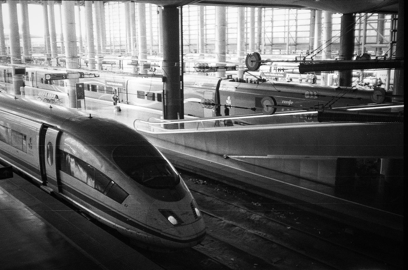
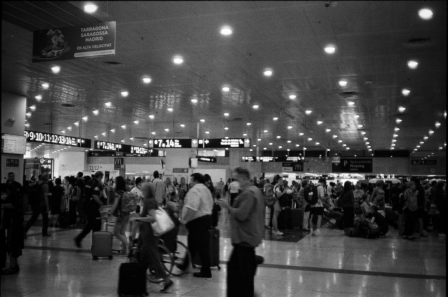
There is a similar honesty in the rail images. One photograph shows high-speed trains under a glass-and-steel roof, all aerodynamic noses, columns, and platform numerals. Another concourse scene pushes the point further with destination boards naming Tarragona, Zaragoza, and Madrid alongside the phrase en alta velocidad. Renfe’s Madrid-Barcelona high-speed corridor indeed runs through cities including Camp de Tarragona and Zaragoza, making those names more than atmospheric detail. They place Barcelona inside a national movement grid. In the logic of this photo set, the city is not only a destination. It is a hinge between local circulation and longer-distance trajectories.
Commercial typography keeps interrupting that hinge in revealing ways. Fnac appears in a plaza; GUESS turns up on a boulevard; McDonald’s hangs over a crowded hall; MILKSHAKES glows above a service counter; a kiosk is plastered with Magnum, Oreo, Nestlé, and KIBON. None of these brands define Barcelona, but all of them help describe how contemporary cities are actually read at eye level. Public space is never purely civic. It is constantly overprinted by chain logos, sale graphics, ad panels, and food counters. In one street frame, the Catalan phrase Fins al -60% cuts across the scene like a small but telling reminder that Barcelona is also encountered through language fragments and retail prompts, not just through architecture.
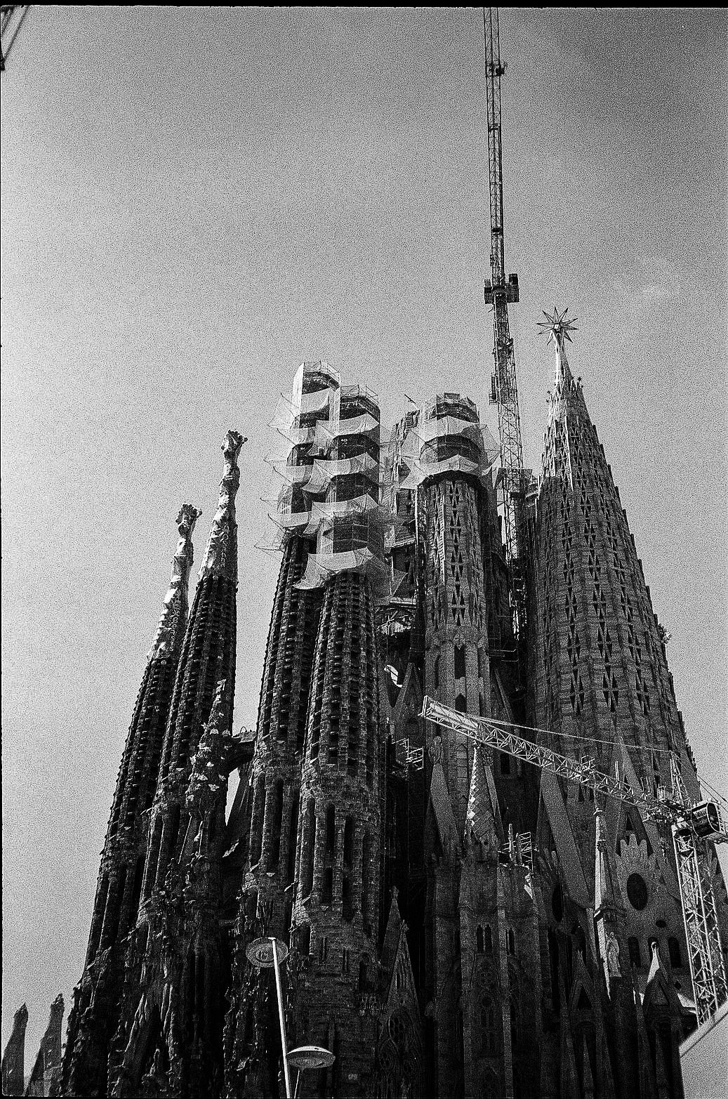
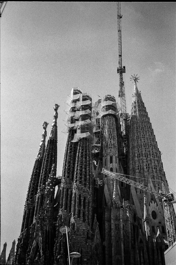
And then there is the Sagrada Família, appearing multiple times and always under construction. That repetition could have turned the set into a standard Barcelona postcard sequence. Instead, the cranes and scaffolding keep redirecting the meaning. In 2022, the basilica was still in an active construction phase; that year saw the completion of the towers of the Evangelists Luke and Mark, while work continued upward on the Tower of Jesus. The photos register this not as background trivia but as visible fact. The church’s identity is inseparable from its unfinished state. It rises vertically above the city, but unlike a frozen monument, it remains entangled with labor, engineering, protection mesh, and heavy equipment.
That unfinished verticality makes a useful counterpoint to the rest of the set. Much of Barcelona here is horizontal: platform edges, promenades, boulevards, shaded squares, beaches, rail halls. Movement happens across surfaces. The Sagrada Família interrupts that field with a dramatic upward thrust, yet it still belongs to the same story. You reach it by line, route, crossing, pavement, and station. It is a node in the network, not a world unto itself.
Maybe that is what this black-and-white film does best. It compresses eras without flattening them into a cliché about old and new. Gaudí’s stone, belle-époque facades, fluorescent metro signage, scooter traffic, and high-speed rail all occupy the same grayscale register. Barcelona emerges as a layered operating system: historic, commercial, coastal, touristed, local, and heavily designed. Not just a city to look at, but a city to move through.