Some cities announce themselves through monuments. Mexico City often does something else. It leaks its identity through systems: the language on overhead signs, the numbering logic of major roads, the utility wires cutting across a bright sky, the rooftop tanks and antennas that turn every building into a working diagram.
That is what gives this set its charge. The frames are casual and sometimes blurred, shot on an Olympus Trip 35 with expired film in April 2022, but they keep returning to the same idea: a metropolis understood less as spectacle than as surface infrastructure. The city appears in fragments of Avenida Universidad, Ángel Urraza, Avenida Eugenia, Eje 5 Sur, Eje 6 Sur, a PEMEX price board, parked cars, apartment balconies, palms, and improvised rooflines.
The effect is refreshingly anti-postcard. Instead of chasing the usual Mexico City shorthand, these images read the capital the way residents do in motion: through directional cues, service networks, branded roadside design, and the domestic adaptations that make dense urban life work. Even the quieter interior scenes belong to that same story. They are not an escape from the city outside; they are part of the same operating system.
The word “Eje” does more work than a landmark ever could
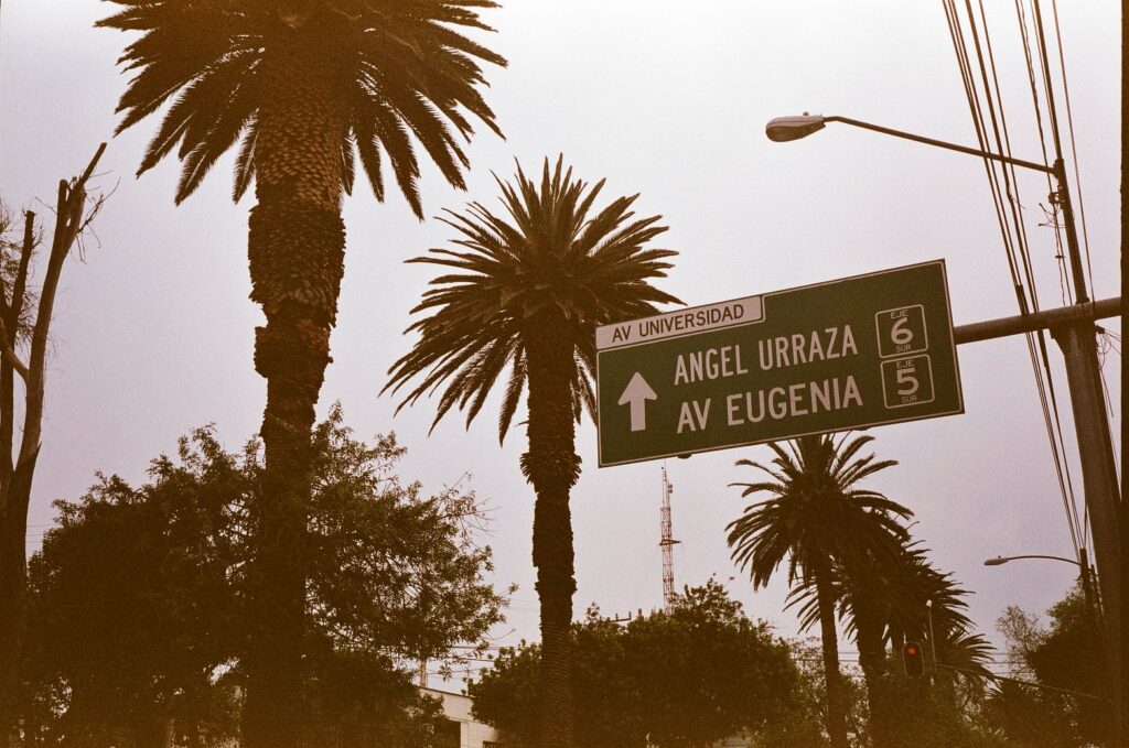
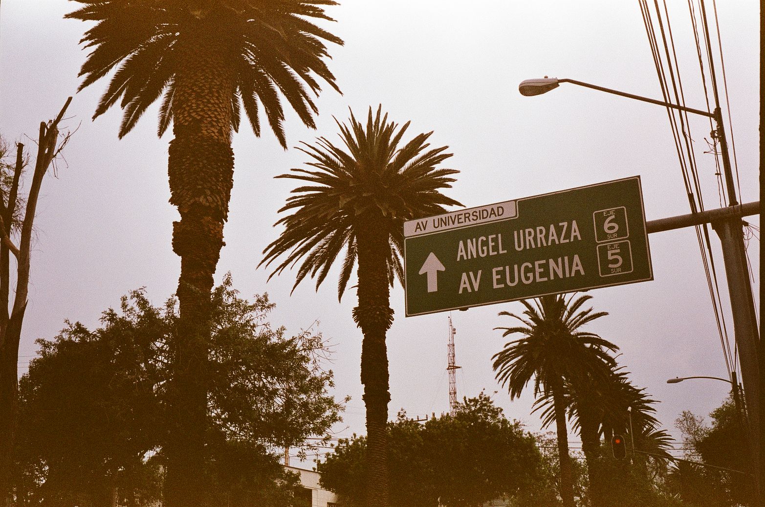
The most precise image in the set is a road sign, and it does more than confirm location. “AV UNIVERSIDAD,” “ANGEL URRAZA,” “AV EUGENIA,” “EJE 6 SUR,” and “EJE 5 SUR” form a distinctly capitalino vocabulary, the kind of everyday text that makes Mexico City legible to itself. These are not romantic street names floating free of context. They belong to a larger traffic logic.
Mexico City’s ejes viales remain an official mobility category in city data, not just a leftover phrase from older residents. The system took shape in the late 1970s and early 1980s as part of a major reorganization of urban traffic, and by the end of 1982 planners had completed 34 ejes covering roughly 500 kilometers. Broad numbered routes such as Eje 5 Sur and Eje 6 Sur still read as part of that quasi-grid: directional, functional, metropolitan.
That matters because it changes how the photographs work. The sign isn’t just wayfinding; it’s urban metadata. Avenida Universidad carries its own weight in the city’s southern expansion, tied historically to access toward Ciudad Universitaria and to the institutional gravity of UNAM. Ángel Urraza and Eugenia, meanwhile, are valuable precisely because they are ordinary. They place the viewer in a south-central corridor associated with Benito Juárez borough and adjacent areas, where daily navigation depends on these names more than on famous destinations.
There’s a very Mexico City feeling in that. You understand where you are not because a cathedral or museum enters frame, but because the road system does.
Palm medians, parked cars, and PEMEX graphics make the avenue feel lived-in
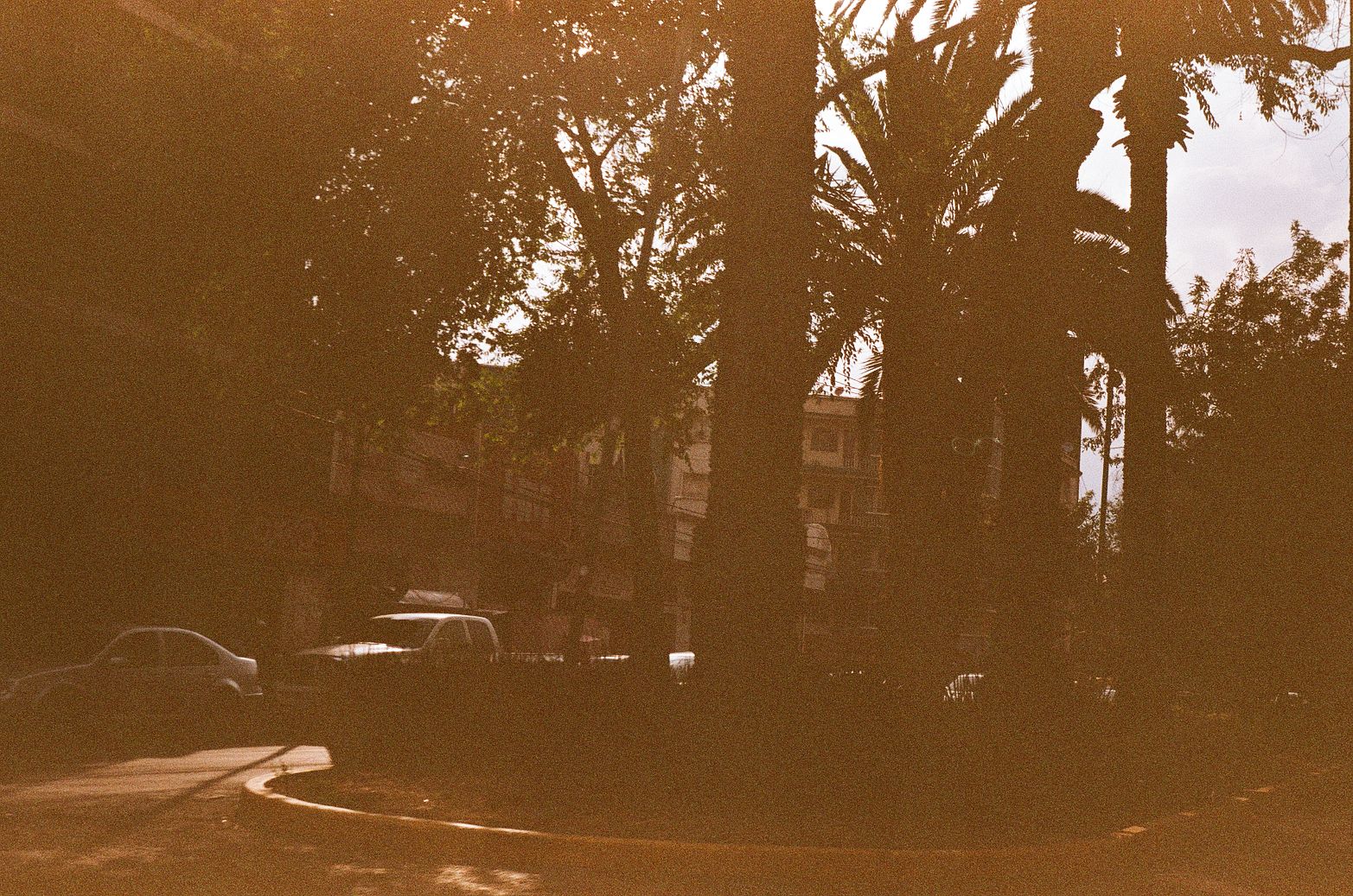
Several frames stay with the broad avenue as a type: palms overhead, curbside cars, traffic lights, utility poles, commercial edges. The palms are especially interesting. In another city they might cue a resort cliché, but here they read more like boulevard infrastructure, part of a landscaped median culture documented in Benito Juárez-area records along Eje 5 Sur and Eje 6 Sur. They soften the hard geometry of the arterials without changing the fact that these are working roads.
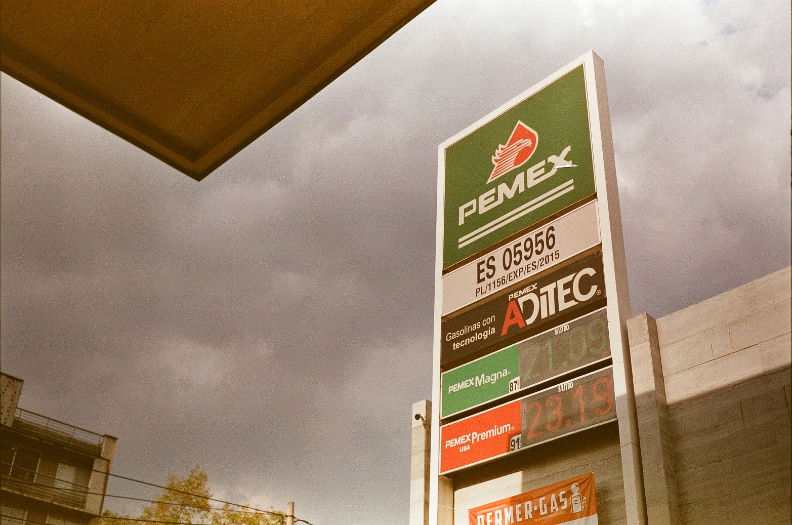
Then there is the PEMEX sign, one of the strongest pieces of visual evidence in the set. It introduces a design language that is both national and local: standardized fuel grades, digital price displays, franchise branding, and the familiar vertical totem rising above the street. PEMEX’s own materials make clear that service-station identity has long been managed through manuals, signage systems, and evolving image programs. In other words, this is not visual clutter. It is designed public-facing infrastructure.

The photo understands that instinctively. The sign stands against a pale sky beside wires and concrete, and suddenly a gas station becomes part of the city’s graphic identity. This is the sort of thing analog film is unexpectedly good at capturing. It flattens hierarchy. A fuel board, a palm, a utility line, and a building edge all occupy the same emotional register, which is exactly how they often appear when you’re moving through a city without trying to aestheticize it too much.
Even the secondary brand fragments in the series, a partial MINI sign here, a Corona label there, help sketch an ordinary commercial landscape where global and local signals share the same roadside field. Not iconic. Just present, which is more useful.
Mexico City’s rooftops are full of equipment because domestic life extends upward
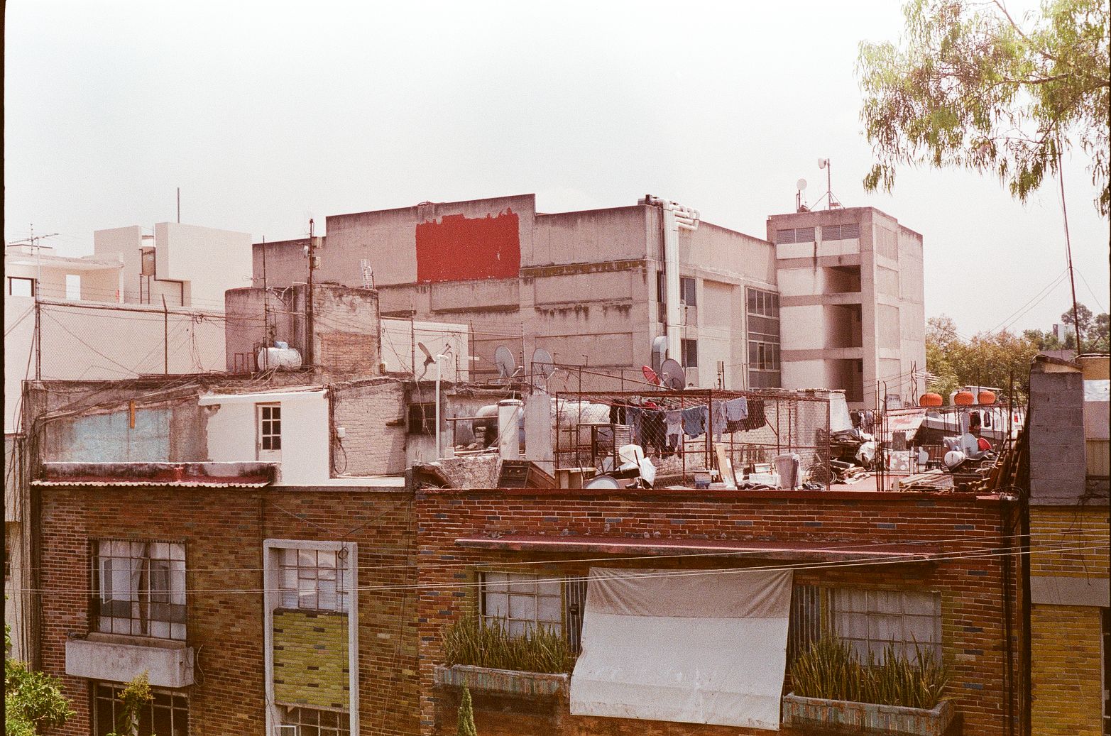
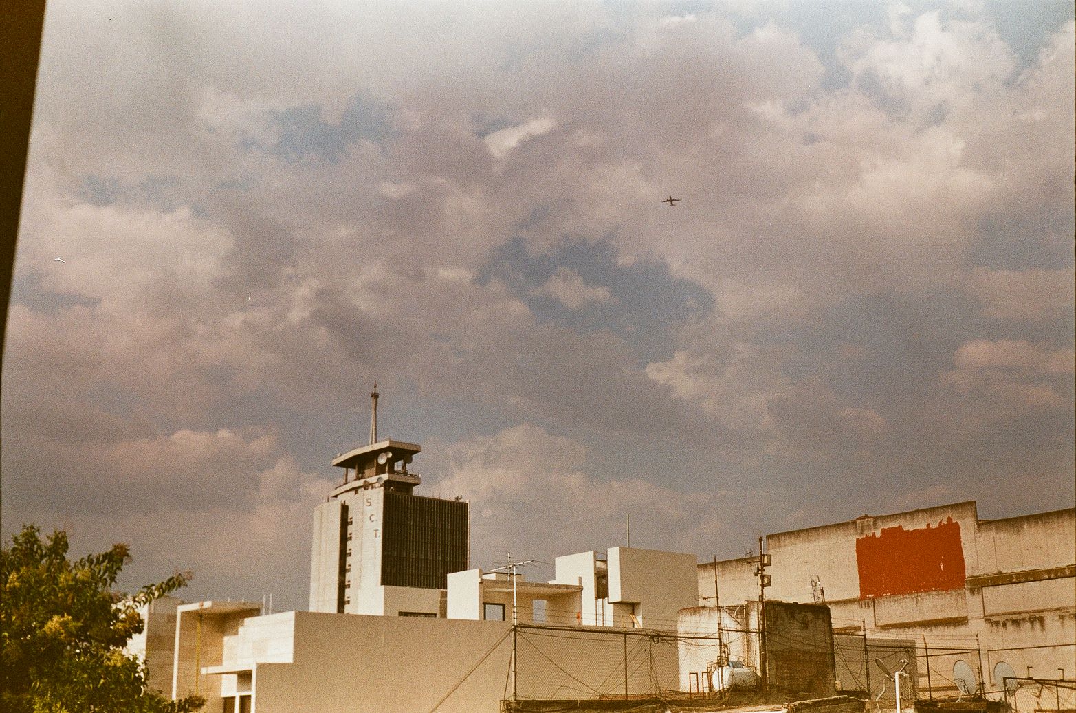
The rooftop scenes are where the article stops being about circulation and becomes about maintenance. Flat roofs carry dishes, antennas, laundry lines, pipework, patch repairs, sheet materials, and above all water tanks. They show a city that solves daily needs in plain sight.
In Mexico, the tinaco is not an eccentric detail. It is common enough to appear as a standard housing variable in the 2020 census, and INEGI’s national results show that 64.4 percent of inhabited private dwellings had a tinaco while 61.6 percent had a cisterna. That doesn’t tell us anything specific about the exact households in these photos, and it shouldn’t be stretched into a claim about scarcity in any one building. What it does confirm is that visible rooftop water storage is part of normal domestic infrastructure.
Seen that way, the roofs in these images are not messy back-of-house zones. They are active service platforms. They hold the hardware that supports apartment living in dense neighborhoods: storage, signal, drainage, drying, repair, extension. Mexico City’s own rainwater-harvesting programs describe a larger ecosystem of gutters, pipes, filters, separators, disinfection, and storage, which helps explain why a roofline can look so mechanically busy. The house does not end at the ceiling. It keeps going upward.
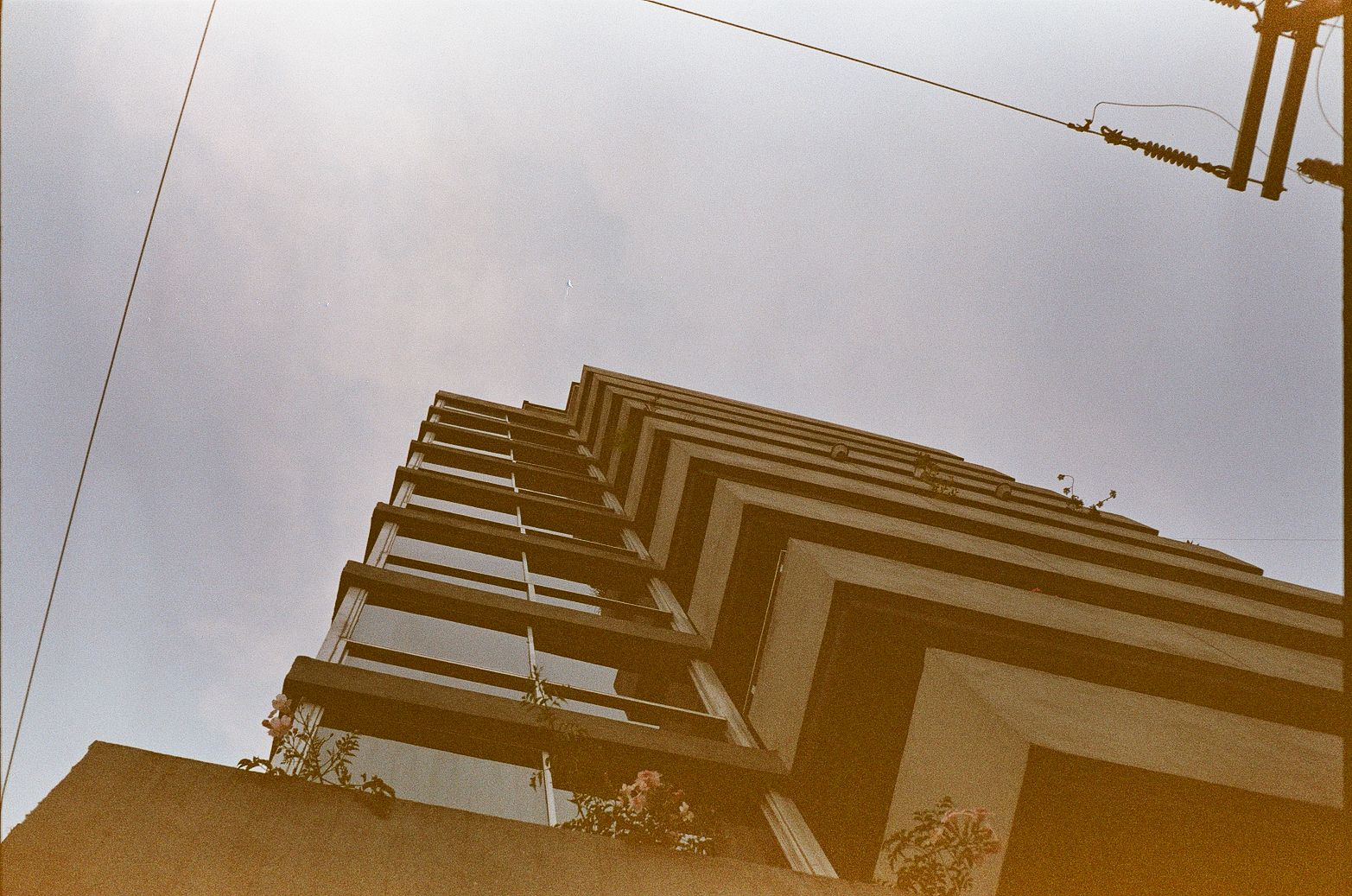
There is also a strong visual contrast here between modern apartment slabs with disciplined balcony grids and older low-rise structures accumulating fixes over time. But the contrast isn’t really between old and new. It is between different expressions of the same urban fact: buildings in Mexico City wear their systems on the outside.
Inside the apartment, the city doesn’t disappear
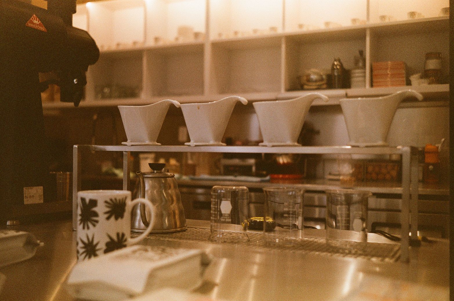
The interior photographs matter because they refuse the usual split between urban exterior and private retreat. A desk by a window facing another building, potted plants, coffee gear, monitors, a cat on a perch: these are small domestic scenes, but they belong to the same editorial argument as the road sign and the rooftops.
In dense parts of Mexico City, the apartment is never fully sealed off from the systems around it. Windows open onto neighboring facades at close range. Wires remain in view. Light is shaped by the geometry of adjacent buildings. Work surfaces, brewing tools, houseplants, and pets all sit inside an environment structured by proximity and infrastructure. The domestic sphere is not a separate narrative from the street. It is one more layer of the same metropolitan stack.
That continuity is one of the more modern things about the set. Not modern in the glossy smart-city sense, but in the lived sense familiar to anyone who has tried to make a good room inside a loud, dense, imperfect city. The scenes of coffee preparation and desk life suggest attention, routine, and design consciousness, yet they never drift into lifestyle-magazine fantasy. They stay tethered to window frames, neighboring walls, and the practical intimacy of compact urban living.
It’s an important corrective to travel imagery that treats interiors as generic comfort and streets as authentic chaos. Here, both are simply parts of the same machine.
Photography by Gil DeSaant. Explore more of his photography at gildesaant.com.