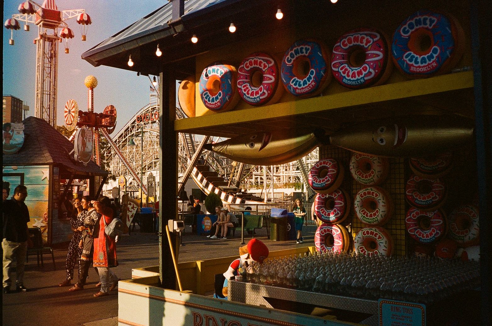
Coney Island has always understood that summer in New York is partly a design problem. You need the beach, obviously, but you also need the graphics: the giant hot dog, the vertical ride sign, the Ferris wheel silhouette, the bulbs that still read as excitement even in daylight. In these Brooklyn frames, the strongest subject is not leisure in the abstract. It is the way Coney Island turns memory into visible infrastructure.
What stands out is how insistently the camera returns to names. Nathan’s. Luna Park. Wonder Wheel. Cyclone. Thunderbolt. Paul’s Daughter. None of them function as neutral labels. They operate more like cultural software, loading older versions of American summer into the present tense. Some of that history is real and continuous. Some of it is revived, repackaged, or strategically restaged. Either way, the effect is the same: Coney Island presents itself as a place where nostalgia can be consumed as confidently as a hot dog or a ride ticket.
The useful complication is that the fantasy frontage never fully detaches from the city around it. Apartment towers crowd the horizon behind the beach. The terminal subway line arrives practically at the edge of the spectacle. Parking, fencing, storefront gates, concession stands, and public shoreline all remain in frame. Coney Island is not a sealed retro set. It is an operating urban district where public beach access, amusement branding, and redevelopment pressures all coexist on the same block.
The skyline keeps interrupting the postcard
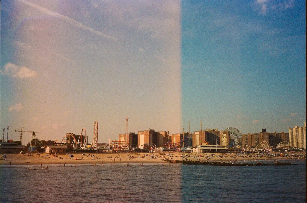
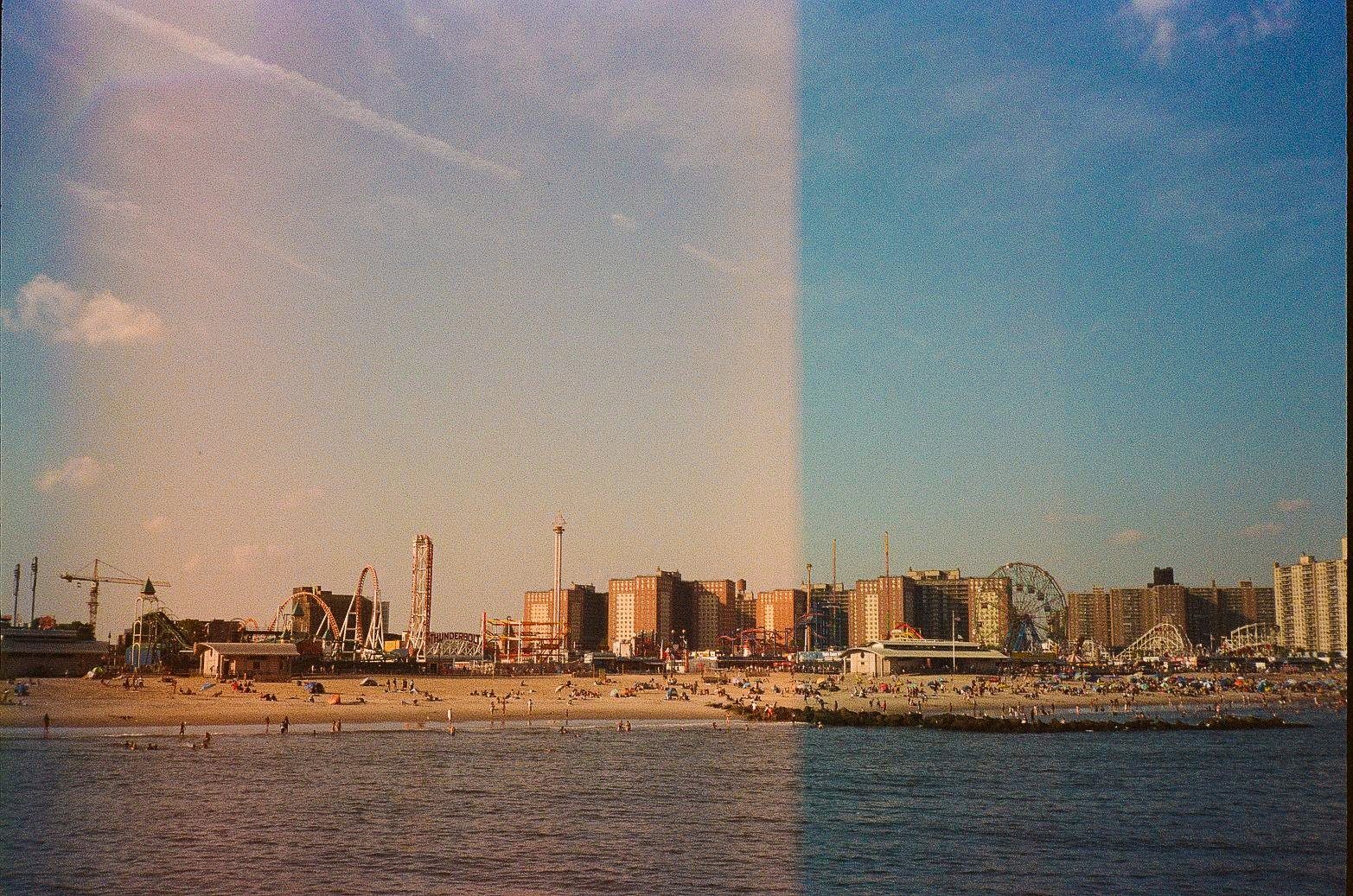
The classic Coney Island image is supposed to isolate pleasure: surf, sand, rides, sky. But the wider beach views here refuse that clean separation. The Atlantic shoreline, roller coaster tracks, Ferris wheel geometry, and a wall of residential buildings all sit in a single visual stack. That compressed composition matters because it undercuts any easy reading of Coney Island as a preserved seaside escape. It is a metropolitan beach, with density built right into its identity.
New York City Parks has long described Coney Island Beach and the Riegelmann Boardwalk as a public summer destination where beach, boardwalk, and amusements are linked rather than experienced as separate zones. Historically, expanded railroad lines after the Civil War brought huge numbers of New Yorkers to the area, helping make Coney Island a mass leisure ground instead of an exclusive resort. That older transit logic still holds. The skyline in the background is not visual noise; it is evidence of the same civic equation. This place works because it is plugged into the city.
The photos make that urban condition impossible to romanticize away. High-rises loom behind rides. Construction and ordinary housing remain part of the horizon line. Planning documents tied to the 2009 rezoning make clear that amusement uses and nearby residential growth have been shaped together, not as separate worlds. Coney Island’s summer mythology survives not by escaping New York, but by functioning inside it.
Some icons are survivors, others are remakes with better lighting
Coney Island’s visual power comes partly from the way it mixes true historic artifacts with newer objects that borrow the authority of history. The distinction matters. The Cyclone is not a retro tribute. It opened in 1927, still operates, and carries both New York City Landmark status and a place on the National Register of Historic Places. Deno’s Wonder Wheel goes back even further, to 1920, and was designated a city landmark in 1989. These rides are not just references to the past; they are physical survivors of it.
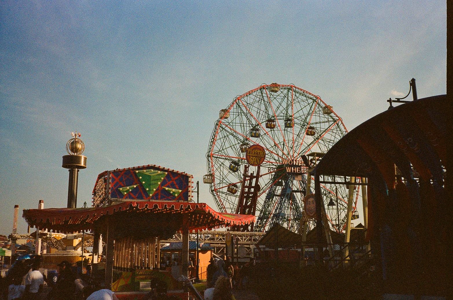
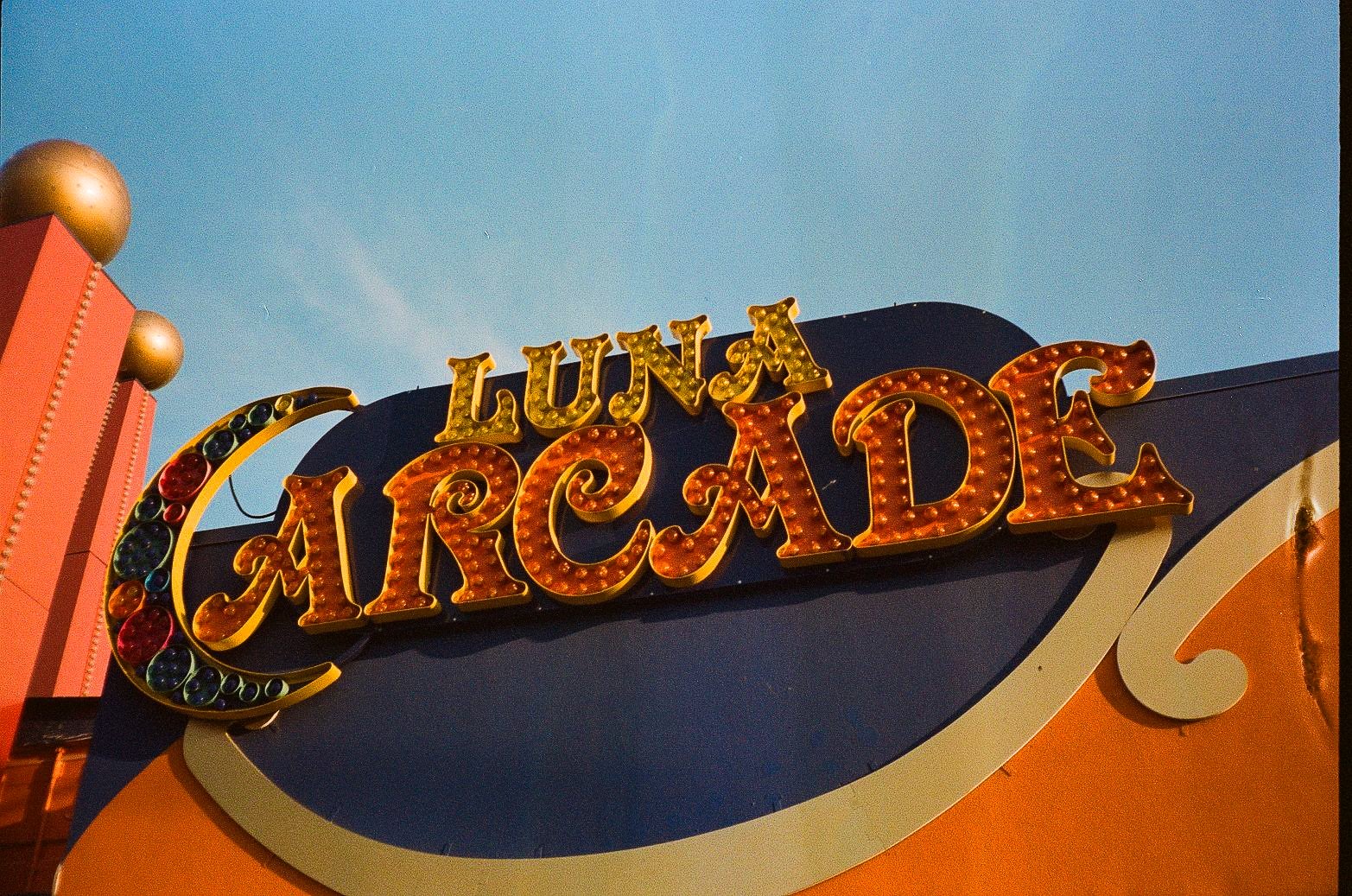
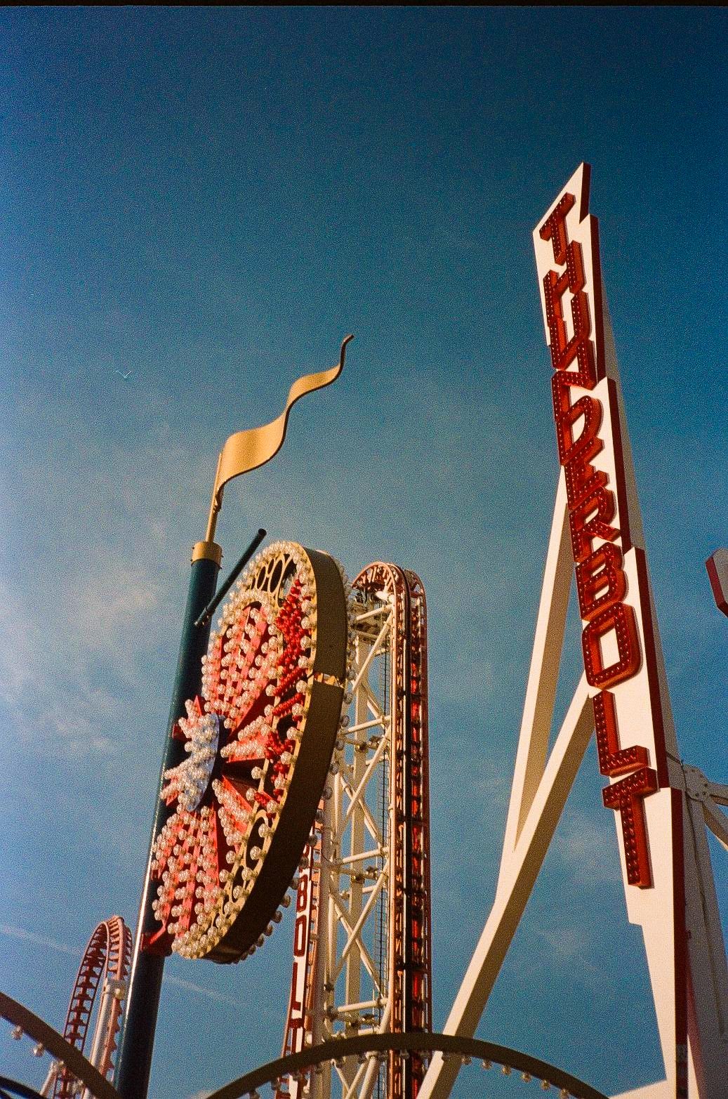
Then there is the other half of the district’s memory system: names brought back to do cultural work in the present. The current Luna Park opened in 2010 as a redevelopment-era amusement park that revives a historic Coney Island name rather than continuing the original 1903 park uninterrupted. The contemporary Thunderbolt, which debuted in 2014, pays homage to an earlier wooden coaster that operated from 1925 to 1982, but it is itself a new steel ride. In other words, Coney Island is not simply conserving nostalgia. It is producing it, updating old brand assets for a new cycle of visitors, investment, and image-making.
The photographs understand this intuitively. Ride names are framed like logos. Mechanical structure becomes secondary to typography and silhouette. That’s a very New York kind of historical consciousness: less museum vitrines, more signage in active service. The district does not ask visitors to verify every date. It asks them to recognize the names, trust the aura, and step into a version of continuity that is partly authentic and partly engineered.
Nathan’s and Paul’s Daughter sell food, but the real product is edible iconography
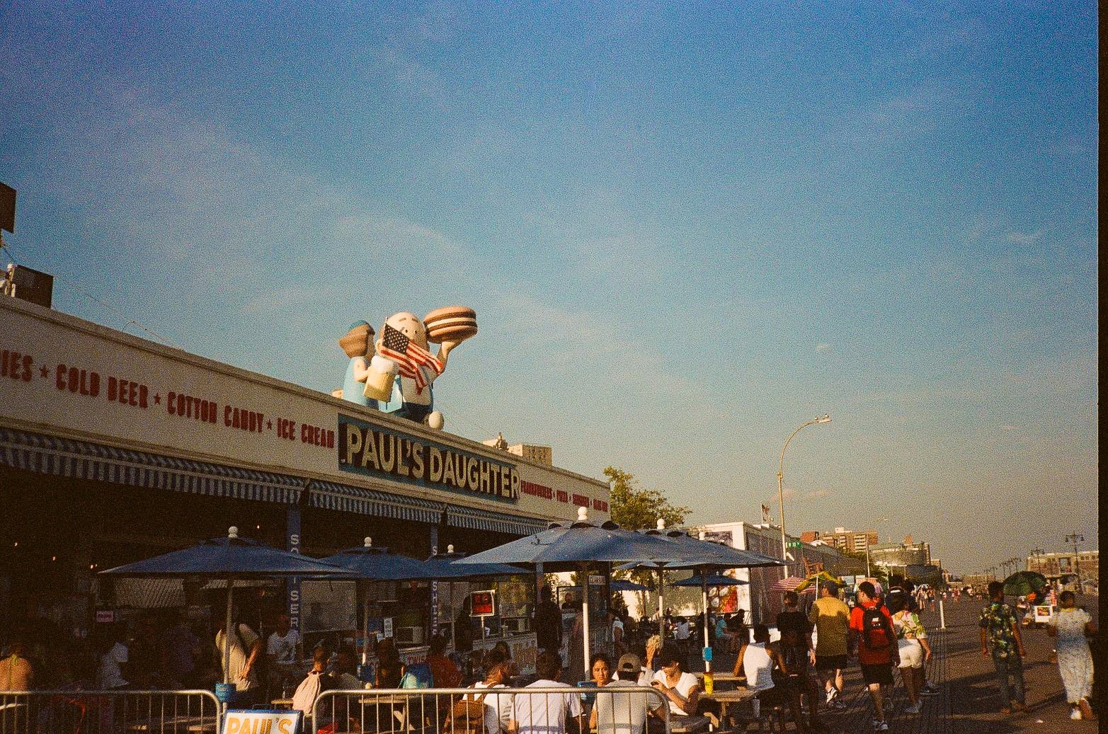
Food appears across the set mostly as surface rather than meal: giant signs, striped awnings, roof figures, funnel cake lettering, shave ice promises, arcade-adjacent snack language. That is not a limitation. It gets to the point. At Coney Island, concession architecture is part of the attraction system, and heritage food brands help hold the district’s mythology together.
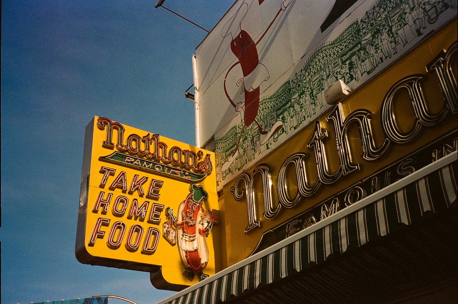
Nathan’s Famous is the clearest example. The company traces its origin to Nathan Handwerker’s nickel hot dog stand on Coney Island in 1916, and that origin story still does heavy visual labor today. The photographed facade, with its oversized branding and hot dog imagery, doesn’t just advertise lunch. It reinforces the idea that Coney Island remains one of the key stages on which American summer performs itself. Hot dogs here are less a menu item than a symbol with industrial reliability.
Paul’s Daughter works differently but toward a similar effect. It is a long-running boardwalk business associated with family continuity, and reporting from Brooklyn Paper notes both its roots in the 1960s and the later pressures to update or preserve its frontage during redevelopment. That tension shows up in the broader streetscape. Nostalgic-looking food stands are not necessarily untouched relics. They are maintained, repainted, adapted, and economically stressed. Even the most familiar boardwalk Americana has to survive weather, lease terms, offseason slowdown, and the demands of visual legibility in a crowded entertainment corridor.
This is what makes the signs interesting. They are cheerful, but not innocent. They carry decades of accumulated memory while also functioning as hard-working commercial graphics in a seasonal economy. Coney Island’s snacks are famous, but their real durability may lie in how well they read from across the midway.
The subway is part of the illusion, and that makes it more democratic
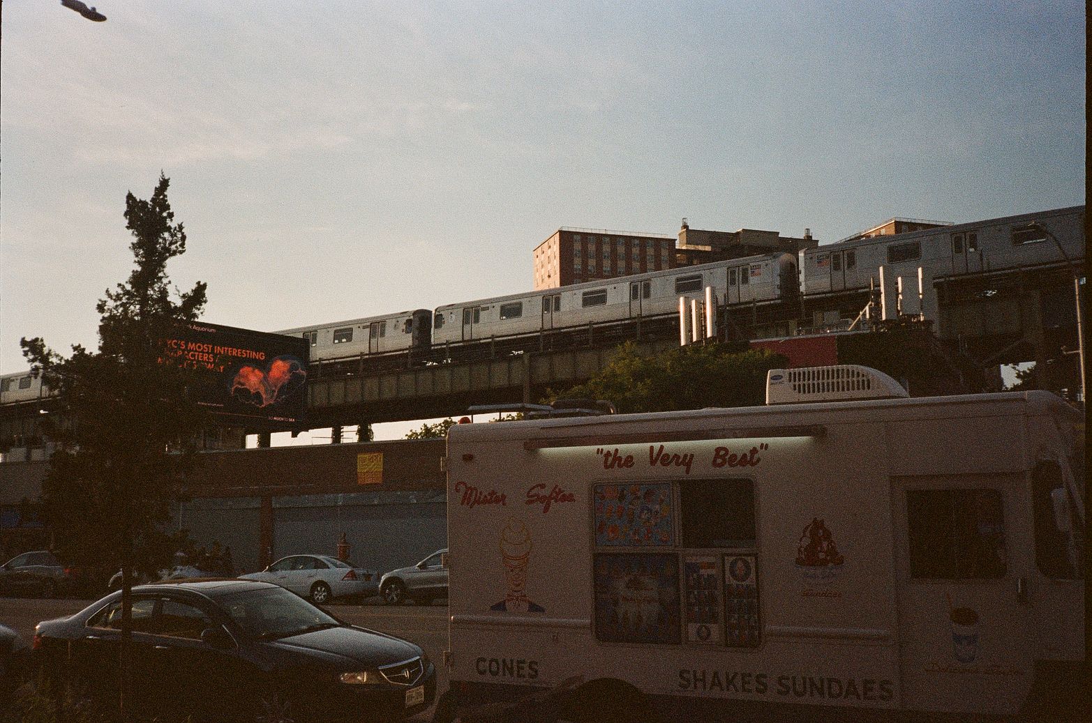
One of the smartest images in the set is the elevated train passing above street traffic and an ice cream truck. It cuts through the nostalgia with a reminder that Coney Island is not reached by pilgrimage or private enclave logic. It is reached by public transit. Today, Coney Island-Stillwell Avenue serves as a terminal for the D, F, N, and Q lines, and that matters as much culturally as any ride marquee. The fantasy zone is built into the same network that carries commuters, students, shift workers, and everyone else.
That transit connection has deep roots. NYC Parks credits rail expansion with helping transform Coney Island into a major mass destination in the first place. Summer memory here has always been infrastructural. The boardwalk glow and the beach-day mythology depend on systems that are stubbornly ordinary: tracks, platforms, public shoreline management, concessions, zoning, maintenance, policing, cleanup, and seasonal labor. Strip away those systems and the nostalgia machine stops running.
There is something oddly reassuring in that. Coney Island’s sentimental power does not come from exclusivity or distance. It comes from repetition and access. You can arrive under steel beams, past parked cars and street vendors, with apartment blocks in view, and still move almost instantly into a visual field of spinning lights, legacy names, and seaside snacks. The illusion works precisely because it never fully hides the mechanism.
Coney Island stays legible by constantly redesigning itself
The most telling thing about these photographs is how often they favor cropped facades, low angles, and ornamental fragments over panoramic spectacle. Bulb-studded circles, painted fronts, vertical letterforms, striped kiosks, and oversized commercial graphics do the heavy lifting. Coney Island does not rely on untouched authenticity. It relies on being instantly readable.
That readability is shaped by policy as much as by nostalgia. New York City’s Special Coney Island District was created to preserve and enhance the amusement area while also guiding year-round entertainment development. The 2009 rezoning sought to protect amusement land fronting the boardwalk while encouraging housing and retail opportunities nearby. Recent city reporting shows that redevelopment is still ongoing, with major infrastructure work and new homes continuing to alter the district’s context. So when a facade looks polished, or a historic name appears on a contemporary structure, that is not a betrayal of Coney Island’s identity. It is one of the ways the place keeps itself visible and economically viable.
For anyone raised on the American remix of neon, arcade lettering, and boardwalk sugar, there is a familiar charge in all this. But Coney Island earns that charge through constant maintenance. Its nostalgia is not static sentiment. It is a designed, branded, and regulated urban performance that has to be rebuilt every season. The wonder is not that it looks old. The wonder is how effectively it keeps teaching each new summer how to recognize itself.
Photography by Gil DeSaant. Explore more of his photography at gildesaant.com.