There are older ways of photographing New York. You point the lens up at the skyline, wait for the right patch of evening blue, and let the city perform its usual trick of looking instantly legible. This set goes in another direction. It treats New York less as a postcard and more as an interface: a place encountered through instructions, warnings, arrows, logos, barriers, awnings, ticket windows, and screens.
That feels true to the city most people actually move through. New York is full of memorable architecture, but daily experience is mediated by systems that tell you how to enter, where to stand, what line to take, what to buy, what to watch, and which version of the neighborhood you are in. Even leisure arrives with a graphic program attached.
The photographs jump from subway platforms to Yankee Stadium, from Chinatown and Little Italy to Times Square and Coney Island, but the connective tissue is consistent. Again and again, the eye lands on surfaces designed to manage attention. The city is not just built; it is labeled.
Transit first, always
If New York has a mother tongue, it may be wayfinding. Before the skyline, before the mythology, there is the overhead sign.
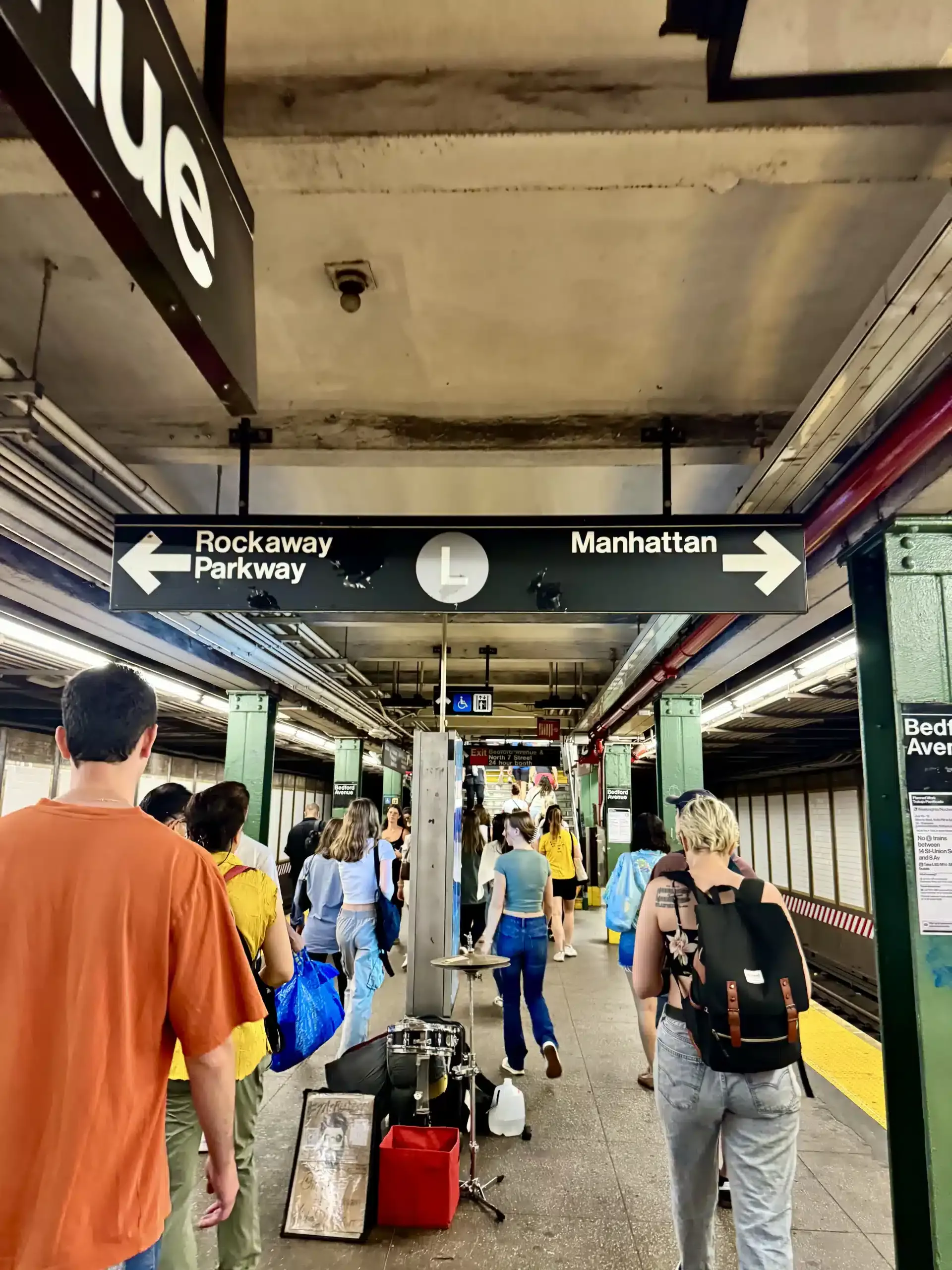
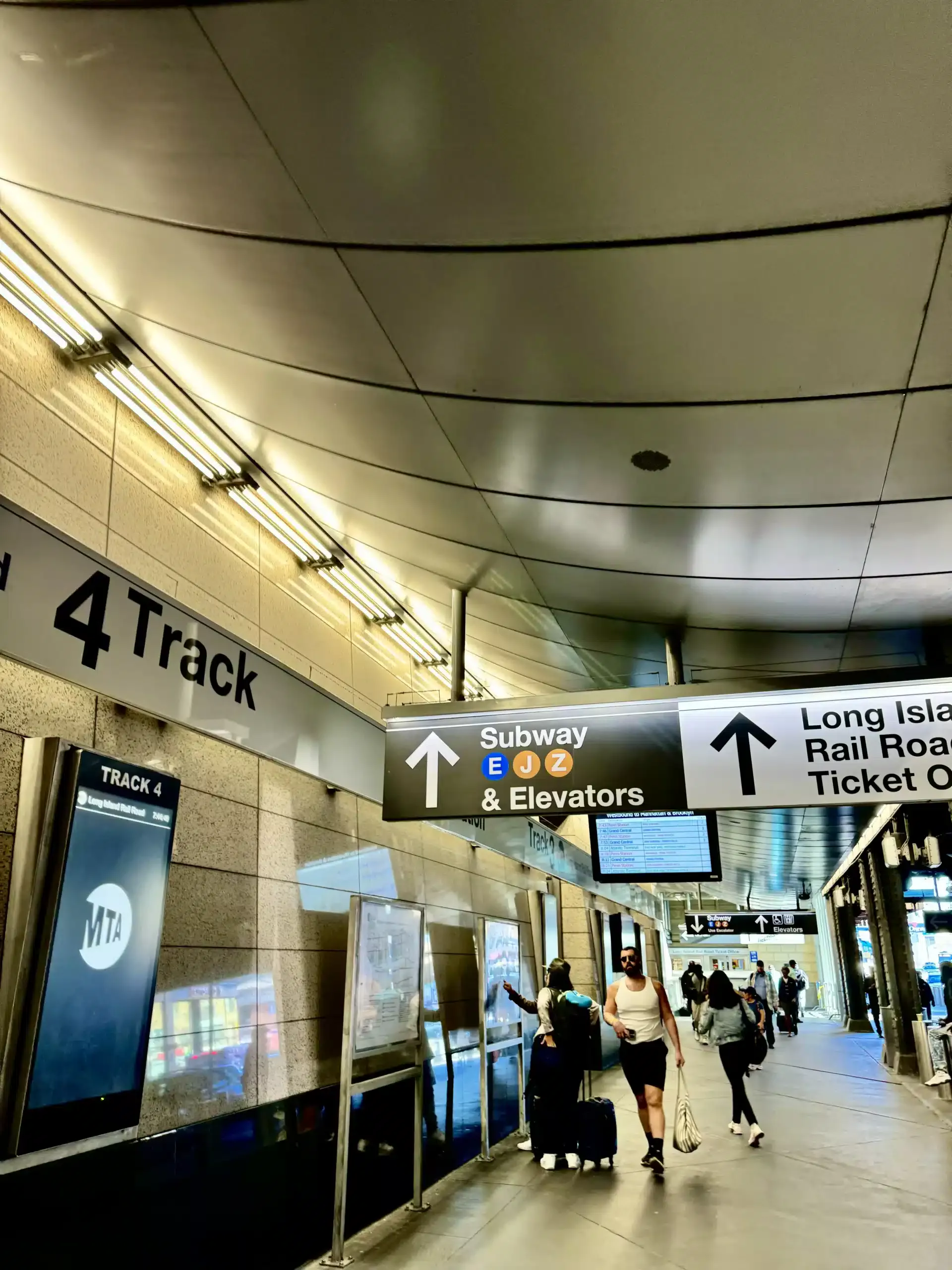
In the transit images, that language is blunt and efficient: track numbers, borough names, exit arrows, line bullets, elevator symbols. One concourse folds the Long Island Rail Road into the subway with a sequence of decisions rendered in black panels and colored circles. Another station platform directs riders toward Manhattan on one side and Rockaway Parkway on the other. A passage near Times Square points riders to the Port Authority Bus Terminal, Downtown Brooklyn, Uptown and Queens. None of this is ornamental, but all of it shapes how the city is understood in motion.
That design logic is not accidental. The Port Authority maintains a formal wayfinding manual for its facilities, a reminder that major transit hubs are governed by standardized visual systems, not improvised signage. On the street, New York has done something similar for pedestrians. NYC DOT launched WalkNYC in 2013 as a citywide wayfinding system, and the first installation was in Chinatown before it spread elsewhere. The choice mattered: one of the city’s most layered commercial districts became an early testing ground for making urban navigation clearer at eye level.
That is a useful key for reading the rest of the set. New York often looks chaotic, but a lot of its most intense environments are tightly structured by graphics.
At the ballpark, branding is architecture
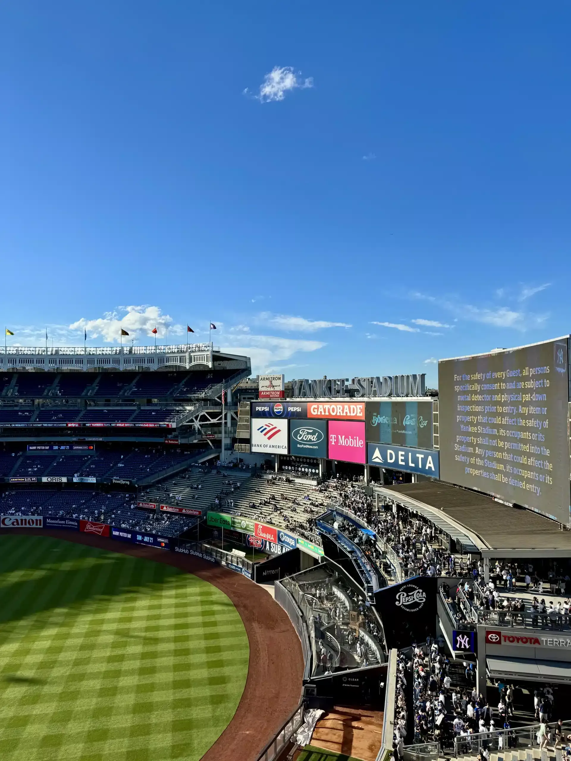
Yankee Stadium appears here not as a romantic cathedral of baseball but as a managed civic interior. The field is present, of course, but so are sponsor walls, terrace names, safety notices, queue points, and gate language. The visual hierarchy is revealing. “YANKEE STADIUM” shares space with Pepsi, Gatorade, Bank of America, Ford, T-Mobile, Delta, Toyota, Uber Eats, and more. The game happens inside a corporate vocabulary.
The Yankees do not hide this. The team explicitly markets “in-stadium signage, branding and exposure” to corporate partners. Even the ticket terms acknowledge that stadium signage can affect sightlines, which is an unusually literal admission that advertising is part of the built experience of spectatorship. Add the posted security notice about metal detectors and bag rules, and the ballpark starts to read as a choreography of movement and compliance as much as a venue for sport.
That does not make it inauthentic. It makes it contemporary. American stadiums long ago stopped being just places to watch a game. They are branded environments where circulation, consumption, and image-making happen at the same time. In the crowd outside Gate 6, phones are already raised before anyone reaches a seat. The event begins at the threshold.
Neighborhoods written in more than one language
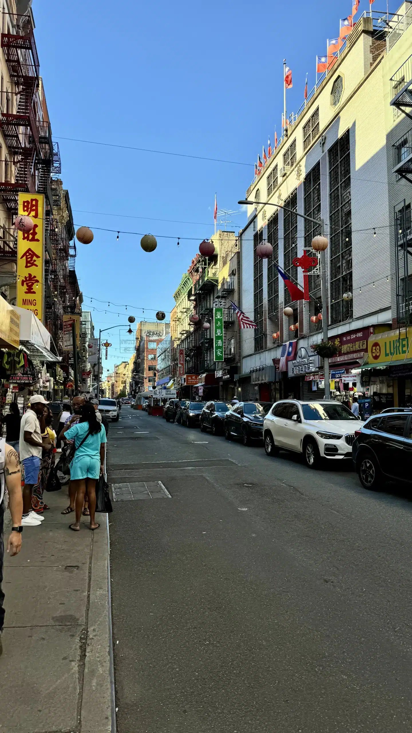
The Chinatown and Mulberry Street frames are among the strongest in the set because they show how neighborhood identity is carried by text before it is explained by institutions. Chinese characters, English storefront names, Vietnamese wording on a pharmacy sign, lantern strings, flags, fire escapes, awnings, and lottery decals all share the same narrow commercial facades. It is not a tidy heritage display. It is a working streetscape where language does practical and symbolic labor at once.
Official city material supports that broader reading without flattening it. New York’s own international business messaging notes that public signage across the city appears in many different languages, which is just another way of saying legibility in New York has never been English-only. Chinatown has also been treated as a design problem in its own right. After WalkNYC began there, NYC DOT later partnered on Gateways to Chinatown, an effort to create a contemporary neighborhood marker near the southern entrance to historic Mott Street. And DOT has described Mulberry Street as a corridor layered with multiple neighborhood histories, connecting Little Italy and Chinatown rather than sealing them into separate museum cases.
That shows up in the photos. Little Italy appears not as frozen folklore but as a branded pedestrian corridor of restaurant signs, Italian ice claims, string lights, and retail theater. Chinatown is similarly mixed: decorative lanterns overhead, storefront merchandise at curb level, tourism-facing typography beside everyday service businesses. These are not untouched enclaves. They are dense commercial interfaces where culture is visible because it has to be read.
Times Square, legally loud
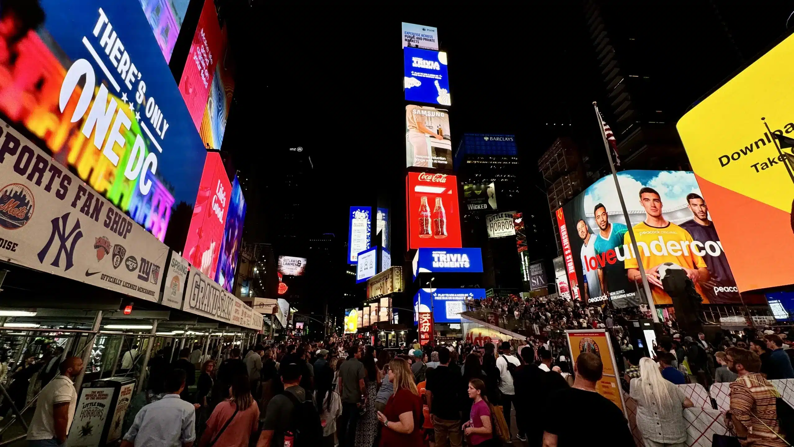
Times Square is often described as if its visual overload simply happened. In reality, its intensity is regulated. New York zoning includes special signage requirements for parts of Times Square, and the city’s Zoning Handbook states that Times Square and Coney Island are among the places where all sign types are allowed without size limits to match the district’s visual force. Elsewhere in the city, business signage is more constrained, with permit and design rules that can tighten further in special or historic districts.
That matters because it turns spectacle into policy. The giant ad canyon is not just commerce running wild; it is a planned condition.
In these images, Times Square appears in daylight and at night, which is the right way to understand it. By day it is still a traffic corridor packed with theaters, service vehicles, chain signage, and stacked media surfaces. By night it becomes a public theater of LEDs and crowd behavior. Broadway titles, streaming campaigns, sports retail, corporate ads, nonprofit messaging, souvenir stores, red traffic lights, and the TKTS steps all compete without canceling one another out. It is messy, but it is legible in a specifically New York way: too much information, delivered with total confidence.
If the 1990s taught us to read cities through MTV editing and mall signage, Times Square is the supersized sequel—less channel surfing than being physically inside the feed.
The Portal and the screenification of public space
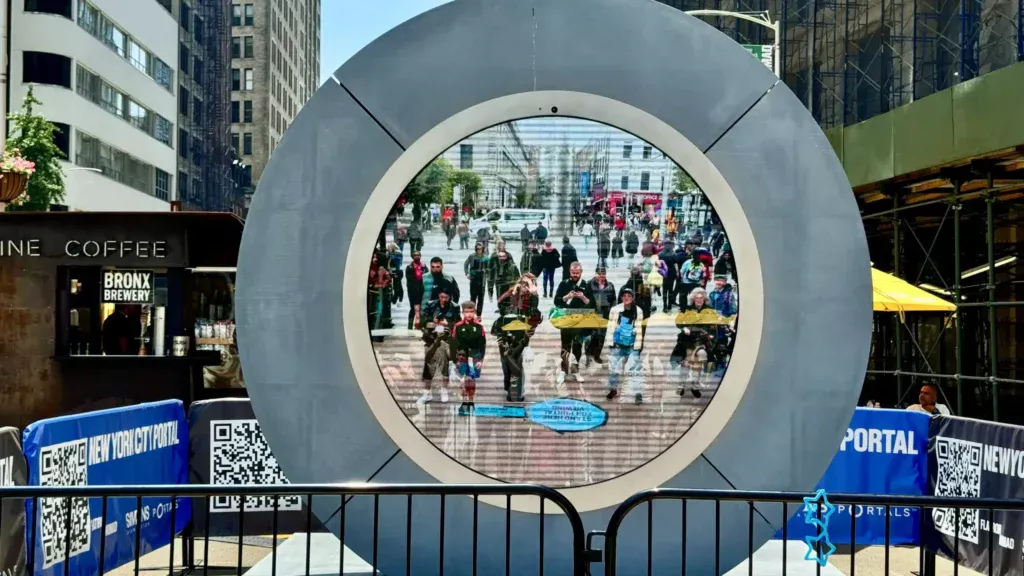
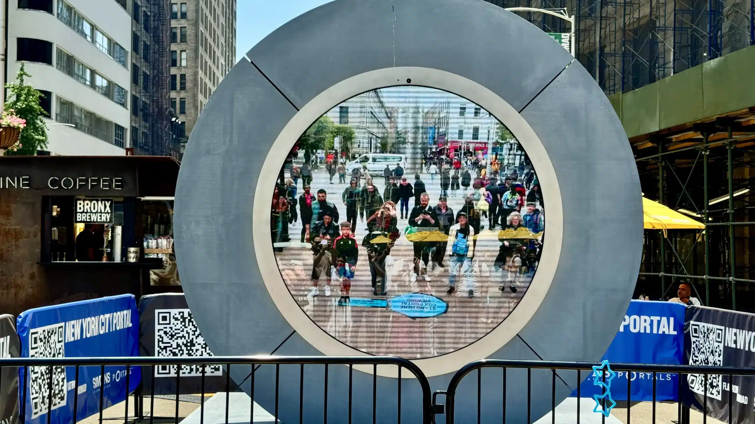
No image in the set makes the article’s premise clearer than the New York City Portal. Installed on the Flatiron South Public Plaza on May 8, 2024, the circular live video work linked New York and Dublin in real time through a collaboration involving the Flatiron NoMad Partnership, the Simons Foundation, and NYC DOT’s Art Program. It was temporary, displayed through Labor Day 2024, and it was briefly paused after disruptive behavior before reopening with limited hours.
Those facts are straightforward. What they suggest is more interesting. The Portal literalized a trend already visible across the city: public space as a screen-mediated encounter. A plaza became a live interface. Around it, there were barricades, QR codes, sponsor names, kiosk branding, and the usual Manhattan clutter of scaffolding and storefronts. The installation did not interrupt the city’s visual logic so much as crystallize it. Here was New York looking at itself, and at another city, through hardware, moderation, and crowd management.
For a place so often celebrated for spontaneity, New York can be strikingly procedural. Even wonder gets fenced.
Coney Island’s threshold economy
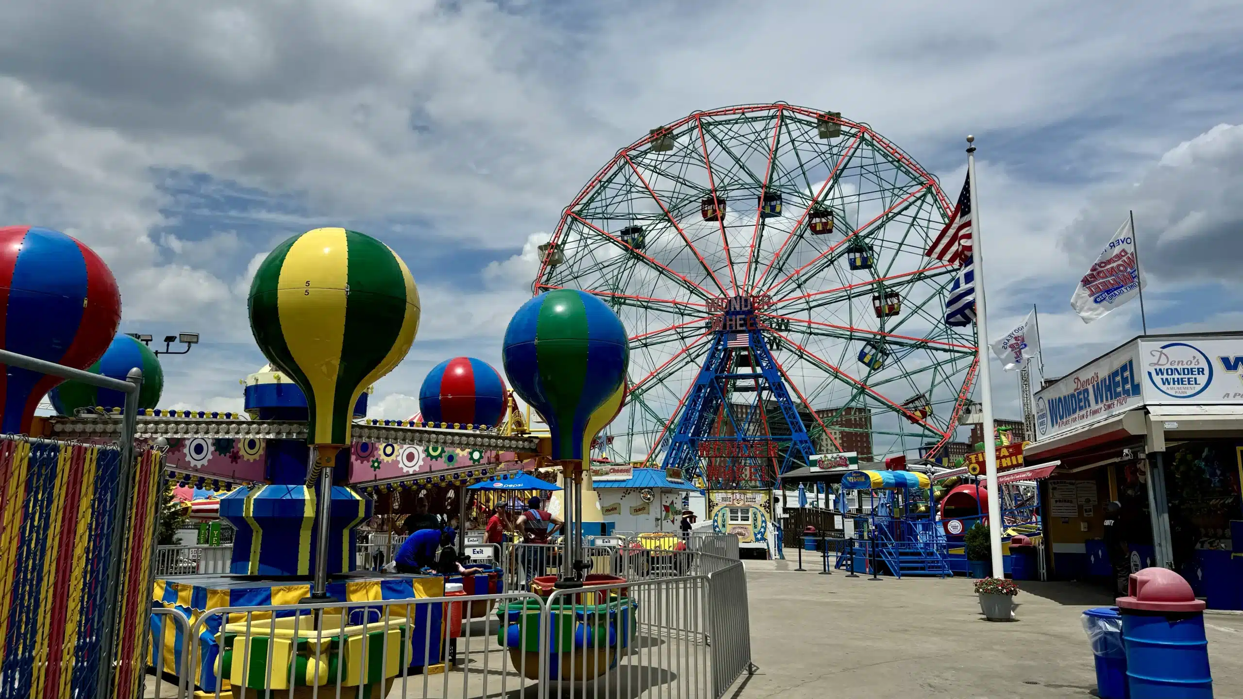
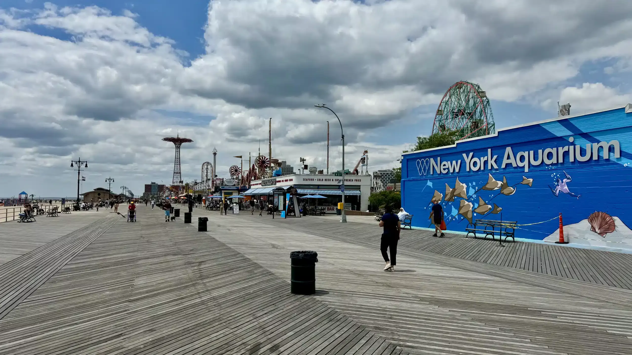
The boardwalk and amusement-zone pictures carry the same pattern into leisure. Ticket booths, gates, branded food counters, ride entrances, queue railings, and giant names—Wonder Wheel, Luna Park, Nathan’s—organize the shoreline experience before the sea gets a word in. The boardwalk is open, but the attractions are all thresholds.
This is not simply nostalgia. Official planning and development language around Coney Island frames the area through both heritage icons and long-term redevelopment. Since the 2009 rezoning, NYCEDC says the district has seen major revitalization backed by more than $750 million in public investment over 15 years. At the same time, planning documents continue to anchor Coney Island’s identity in familiar markers like the Wonder Wheel, the Cyclone, the Parachute Jump, the boardwalk, and the aquarium nearby.
That tension gives the area its charge. Coney Island is one of the few places in New York where spectacle still arrives in carnival fonts and painted gates, but it is also carefully maintained as an economic and visual brand. Nathan’s “Since 1916” messaging does the same work as the Wonder Wheel sign: history rendered as legible frontage.
Even the marine-life images fit this reading. Their deep blue calm offers a temporary break from the city’s textual noise, but they are still highly designed viewing environments—immersive displays built to frame attention with as much control as any stadium ribbon board or transit sign.
The city tells you how to see it
What these photographs finally suggest is that New York’s visual identity depends as much on mediation as on monument. The rooftop water tower, the USPS mailbox, the bike-route sign, the green subway column, the loading-zone notice, the sponsor banner, the pharmacy awning, the red Nathan’s script, the giant digital screen: each is a small instruction about how to use the city.
That may be why the set feels so coherent even as it moves across boroughs and districts. It is not chasing landmarks. It is tracking interfaces. New York appears here as a place of managed spectacle and constant orientation, where public life is filtered through design systems that are practical, commercial, civic, and occasionally absurd all at once.
The old fantasy of New York is that you arrive and get lost. The more modern truth is that the city is always telling you where to go next.